Results
ISO 12233 Slanted Bar Test
The ISO 12233 Slanted Bar is a standard way of testing for edge sharpness. Here, it iis used to look at how the demosaicking algorithms perform at sharp edges.
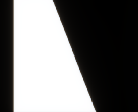
Figure 1. Original Slanted Bar
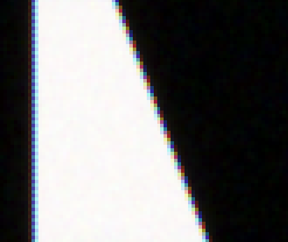
Figure 2. Demosaicked Slanted Bar using Bilinear Interpolation
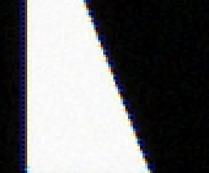
Figure 3. Demosaicked Slanted Bar using PCSD
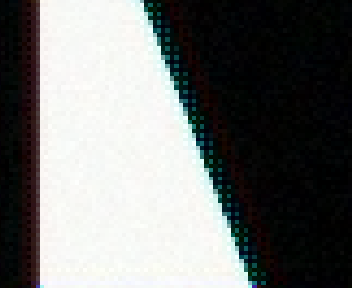
Figure 4. Demosaicked Slanted Bar using Alternating Projections
It is interesting to look at results of demosaicking on a slanted bar. The three demosaicking algorithms each gives very different outcomes.
Bilinear Interpolation (Figure 2) results in a very sharp but 'colorful' edge due to aliasing in the blue and red channels.
PCSD (Figure 3) results in an edge that is not as colorful, but has a deep blue boundary. The blue color at the boundaries exist at locations where the initial mosaic image captured a green value, and has to estimate a the blue value (subcase 1), and the vertical estimates are used (Figure 5). ie.
Figure 5. Blue color at center has to be estimated using the blue samples in the vertical direction
The reason for the blue boundary is that the estimated green values in the vertical directions are negative.
The green estimates are calculated using the equation below, and it does not account for the potential problem of the green estimate being negative.

When the green estimate is negative, the estimated blue value at the center will be boosted to a larger than desired value since it is calculated using the equation below

The reason why only the blue, but not the red is boosted is because the green estimates are all positive for this slanted edge. This however, means that most likely, for some other images, red will be boosted instead of blue.
For Alternating Projections (Figure 4), greenish blue dots are seen at the boundaries. At these locations, the values of blue and green are much higher than the red in those pixels. Outside the greenish blue boundary, a faint red boundary is seen. Examination of this color dot artifact in other images reveal that what the dominant color dot is depends on how the color transitions. When the color transition is from a lighter color to a darker color, from left to right, then blue dots are seen. If the color transition is from dark to light, from left to right, then red color dots are observed. Reasons for this phenomenon might be because of interchanging of subbands, but still needs to be figured out.
Modulation Transfer Function (MTF)
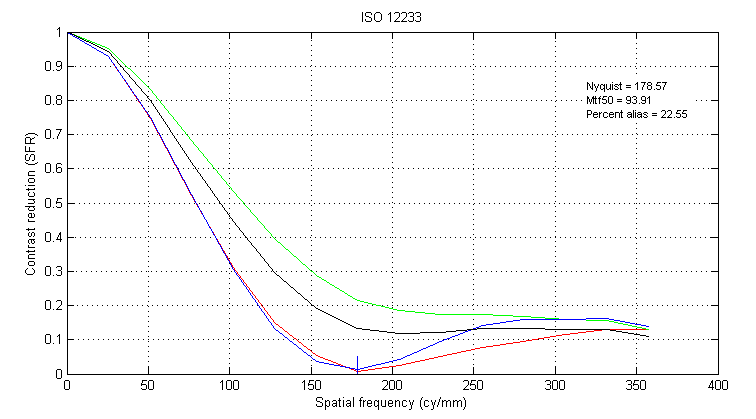
Figure 6. MTF Obtained from Demosaicked Slanted Bar using Bilinear Interpolation
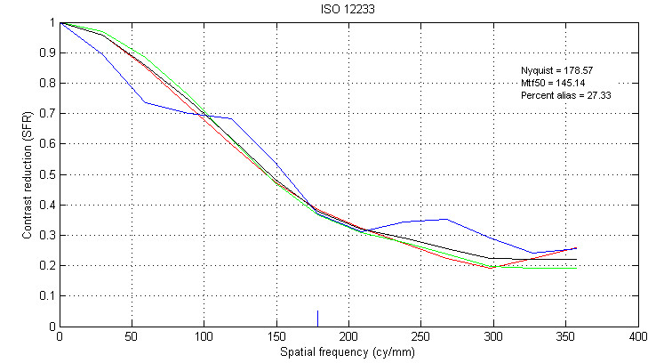
Figure 7. MTF Obtained from Demosaicked Slanted Bar using PCSD
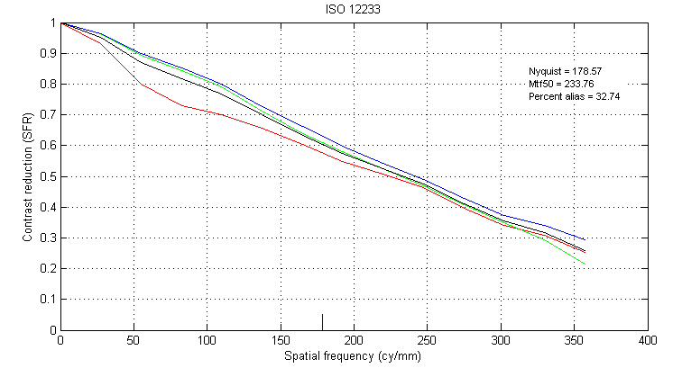
Figure 8. MTF Obtained from Demosaicked Slanted Bar using Alternating Projections
The MFT plot can be used as a guideline on how sharp an edge is, and how much aliasing is present. The basic idea is that the response near an edge is directly related to the line spread function, and the line spread function is related to the MTF by a Fourier Transform [6].
Here, the graphs show the contrast reduction as a function of spatial frequency in the red, green and blue channels. The red, green and blue lines are the color MTF, and the black line is the luminance MFT [6].
Nyquist : The Nyquist sampling frequency at the sensor array
Mtf50: The spatial frequency at which the luminance MTF reaches 0.5.
Percent Alias : The area of the luminance MTF which falls to the right of the Nyquist frequency, indicating amount of aliasing.
It can be seen that for the slanted bar, demosaick using Bilinear Interpolation results in a MTF curve that has the sharpest drop off, and least aliasing (Figure 6), and Alternating Projections results in an MTF curve that has the slowest drop off, and most aliasing (Figure 8). These results can be compared with how the demosaicked slanted bars look. Indeed, Bilinear Interpolation results (Figure 2) in an edge that looks the sharpest, and th color dot artifact in Alternating Projections (Figure 4) makes it hard to define the exact location of the edge.
The weird looking bump in the MTF curve of PCSD (Figure 7) is a result of the PCSD demosaic algoritm boosting th blue channel more than the other 2 channels. This effect is revealed by the dark blue bounadary in the demosaicked edge in Figure 3.