EEG Model for Classifying Dominant Images in Binocular RivalryEE362/Psych221 Final Project - Winter 2009 |
||||||||||||||
|
|
||||||||||||||
|
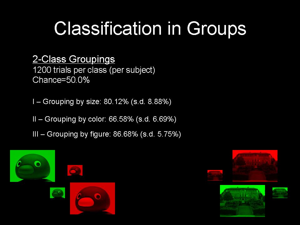
Classification Rates Two-class classification was performed along a single dimension at a time. These rates thus comprise 1200 (4*300) trials per class per subject. The chance classification rate for two classes is 50.0%. Grouping by figure (all penguins vs all buildings) produced both the highest mean rate and the smallest standard deviation. Grouping by size (all large against all small) was the next most successful, and grouping by color (all red against all green) produced a rate considerably lower than did the other two groupings, though this was still above chance level. |
|||||||||||||
Grouping by figure classifies all of the penguins against all of the buildings (shown above).
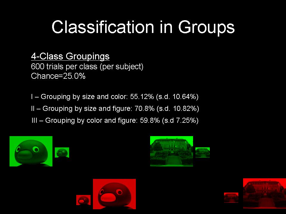
Four-class classification was performed, with the stimuli grouped by two dimensions at a time. The dimensional groupings are as follows: 1) Size and color (large red images vs small red images etc.); 2) Size and figure (large penguins vs small buildings, etc.); and 3) Color and figure (red buildings vs green buildings, etc.). Chance level is now 25.0%, and each class includes 600 trials per subject. Based upon the rates obtained from the two-class classification, we predicted that size and figure would be most successful, followed by color and figure, with size and color performing the least successfully. Indeed, this turned out to be the case, with size and figure outperforming size and color, as well as color and figure by over ten percent in the mean rate, though with significant standard deviation. All rates were well above chance level.
Grouping by color and figure: Green penguin vs red penguin vs green building vs red building.
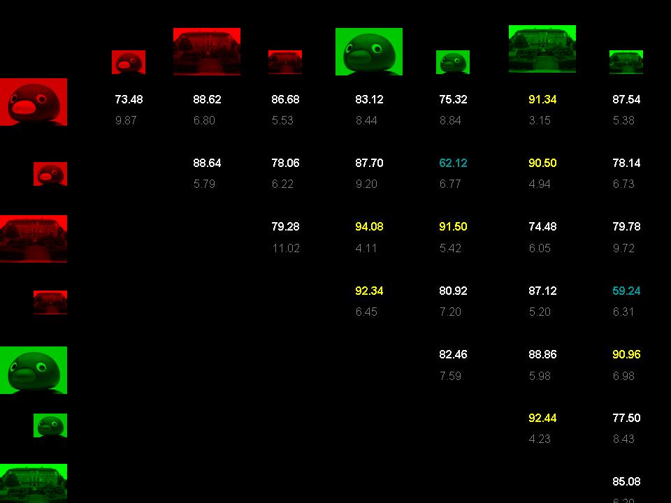
Pair rates were obtained by running all 28 combinations of single-stimulus pairs as two-class classifications. Chance level is 50.0% for each pair, and there are 300 trials per stimulus per subject. The highest pair rates (above 90.0%) are highlighted in yellow in the figure below. The pair earning the highest mean rate overall (large green penguin vs large red building) also produced the highest rate of the entire expermient of 98.8 for one subject. The lowest pairs overall (lower than 70.0%). Both of these pairs comprise small images which differ only by color.
Mean pair rates and standard deviations (in grey)
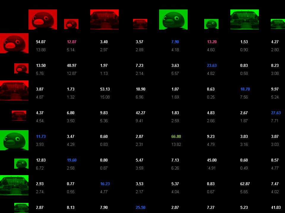
Finally, the mean eight-class classification rate was 50.78%, with standard deviation 10.99. This is significantly higher than the chance rate of 12.5%. Classification rates are shown in the conditional probability matrix below. The leftmost figure in each row represents the stimulus that was presented. The figure corresponding to each column represents the stimulus it was identified as (each row sums to 1). Thus, values on the diagonal show the percentage of correct identifications, while other values indicate degrees of confusion. Based on the group rates and pair rates, we hypothesized that the highest non-diagonal value in each row will be for the stimulus that varies from the correct choice only by color. Also, we conjuectured that the highest non-diagonal values overall will reflect what was found previously from the pair rates - that the most confusion will occur between those small images that differ only by color.
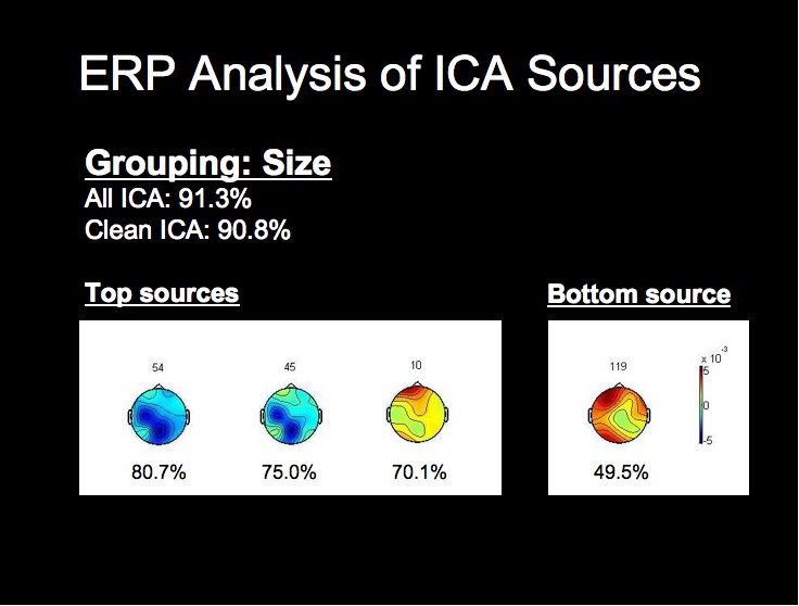
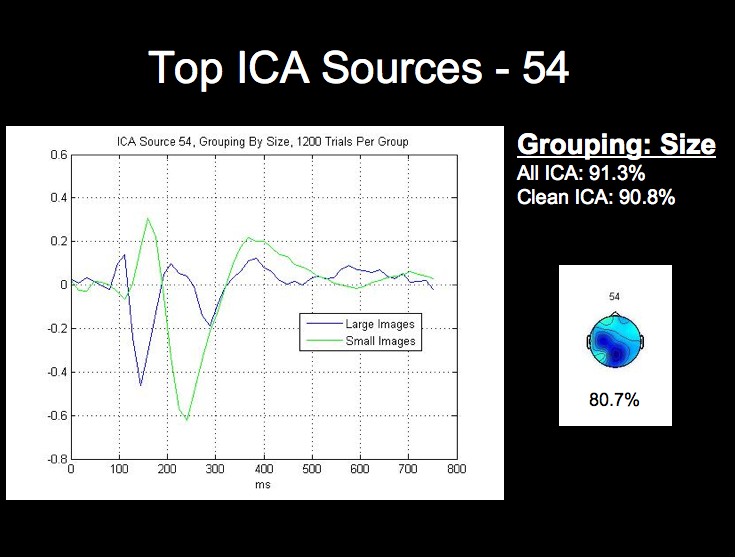
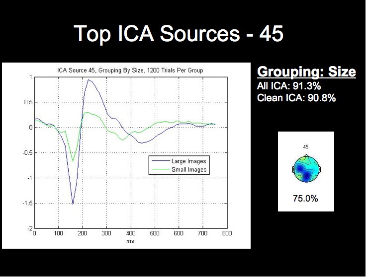
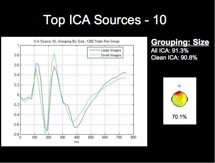
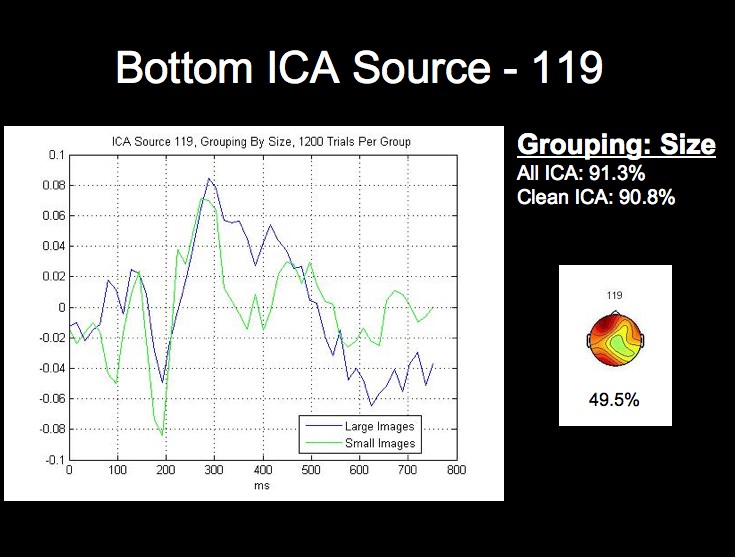
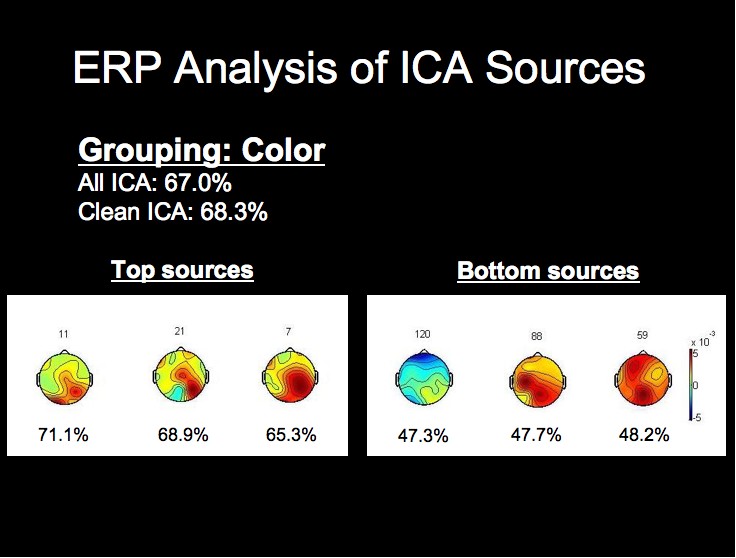
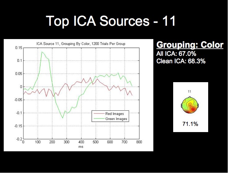
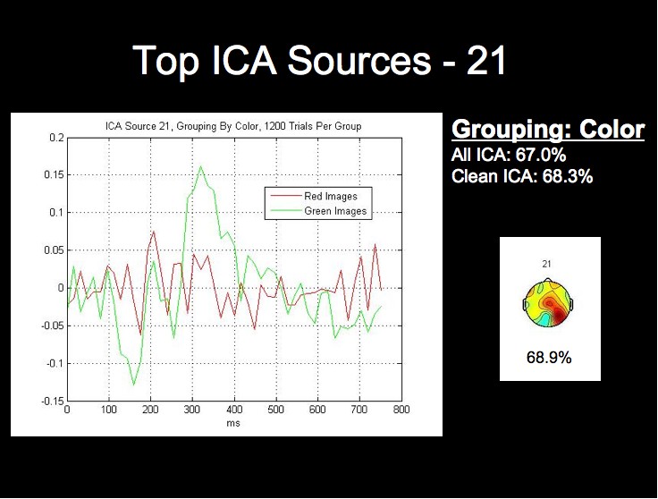
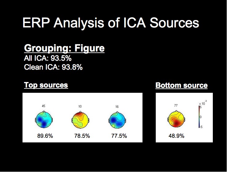
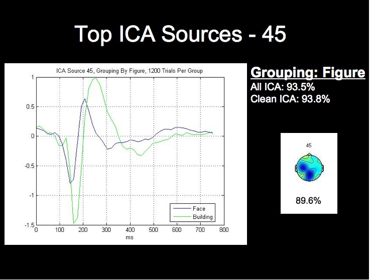
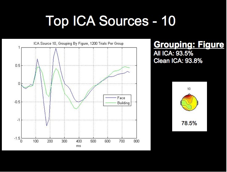
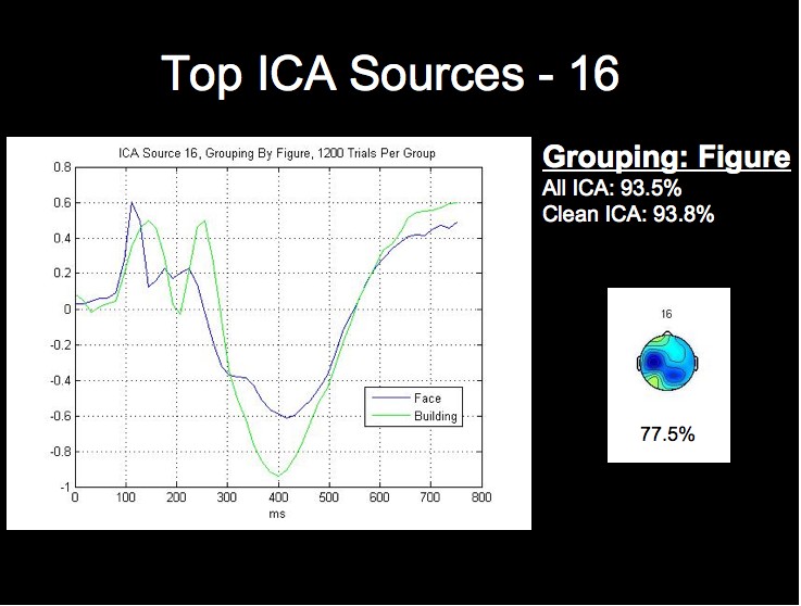
ERP Analysis of ICA Sources
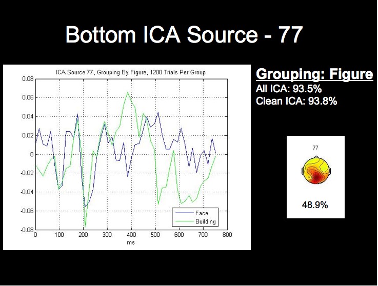
We can see from the above figure that the rate from the top-performing ICA source alone approaches the classification rate acheived using all of the ICA sources, while the lowest source is around chance level. We will not attempt a detailed analysis of the peak timings and amplitudes at this time, but it is already apparent from the following figures that the worst-performing component is much noiser than the most successful sources, especially when considering that each waveform comprises 1200 trials from this subject.
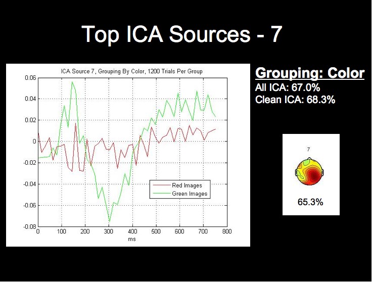
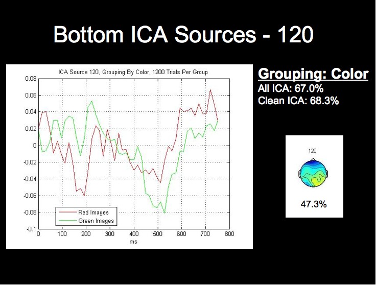
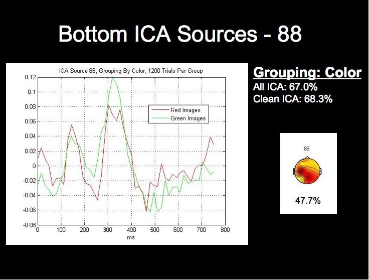
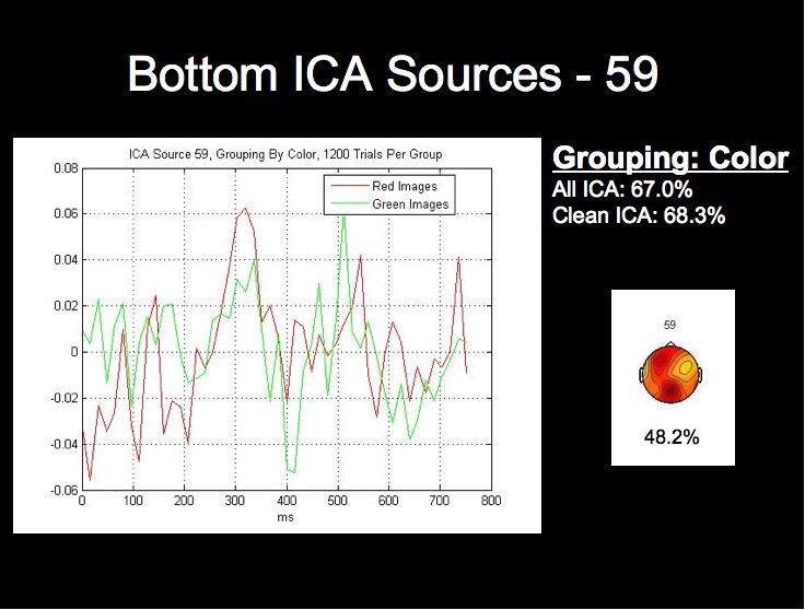
The ICA components and ERPs from the color grouping prove the most interesting in our analysis. We have included the three bottom ICA components for this dimension due to the considerable differences between the waveforms for the best components.
Note first of all that this subject's two highest single ICA source rates exceed the rates obtained by both all 124 sources, and all of the clean sources. This fact, combined with the fact that the lowest rates for this grouping are in fact below chance level, may provide stong evidence that this classification algorithm could be further optimized by using only those sources whose rates are above a certain threshhold for classification.
|
||||||||||||||