EE 362, Winter 2006-2007
Colorfulness Analysis of ClearType Fonts
Jiajing Xu
| Introduction | Methods | Results | Conclusions | References | Appendix |
Results
As I mentioned in the previous section, I consider the fonts being rendered on high resolution display (DPI = 200) as the ideal scenario (the reference) and use S-CIELAB to predict the perceived color difference of the fonts rendered on lower resolution display by comparing the two. There are seven key factors I take into considerations: DPI, viewing distance, letter shape, font size, font family, filter kernel, LCD subpixel structure. The following will be some graphs and explanations of what I observed.
[TOP] DPI Viewing Distance Letter Shape Font Size Font Family Filter Kernel LCD subpixel structure [TOP]
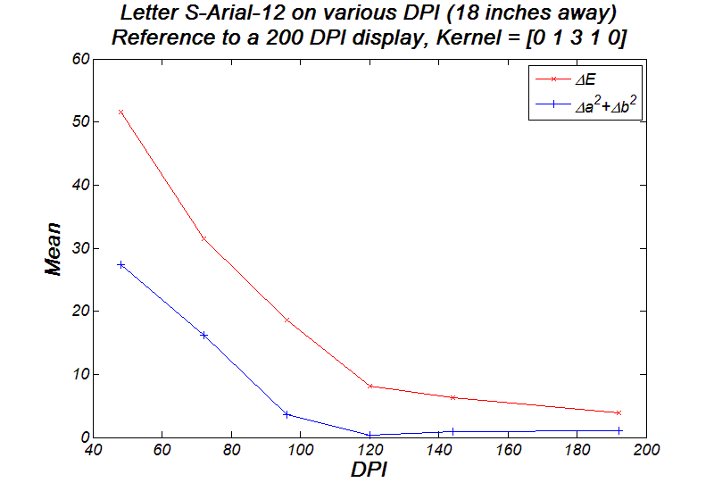
Since S-CIELAB is very sensitive to image's spatial frequency (which is determined by the DPI of the LCD and viewing distance in my project), I record the mean S-CIELAB Detla-E value as I vary one of the two parameters. First off, let's examine how DPI affects the colorfulness. I picked the letter 'S' from Arial family, size 12, and rendered it onto screens with different DPI. (from now on, I'll use the notation S-Arial-12 if I specify the font size, font family and letter info) As the below graph shows, the mean Delta-E value drops dramatically as DPI increases. The sum of Delta-A square and Delta-B square, which is the chromatic discrimination between the two images, is also plotted for further investigation. Apparently, the chromatic difference is a big contributor to the overall Delta-E when LCD has low resolutions; as DPI increases, the chromatic error blurred out and can be nearly noticed.
[TOP] DPI Viewing Distance Letter Shape Font Size Font Family Filter Kernel LCD subpixel structure [TOP]
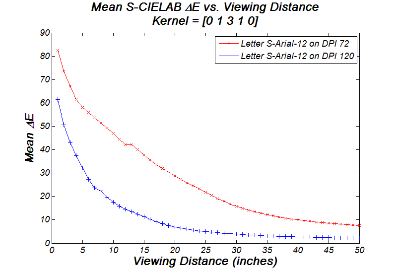
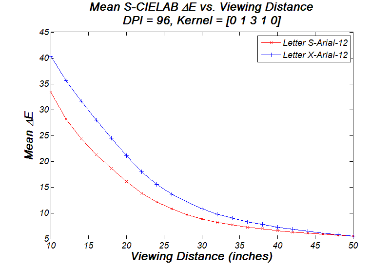
Now let's try moving closer to or farther away from the LCD. The following graph shows the mean Delta-E value versus viewing distance; the study subjects are two letters, S-Arial-12 and W-Arial-12, both being filtered by filter kernel [0 1 3 1 0]. Basically the graph suggests that it is better to view size-12 fonts at least 30 inches away from a 72-DPI LCD. Color artifacts increase dramatically as one approaches to the LCD.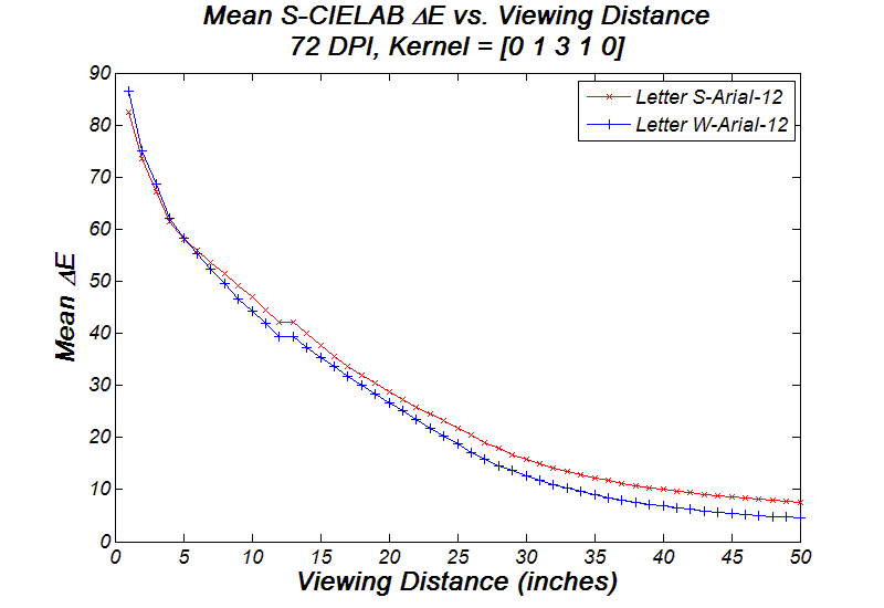
If you have a 120-DPI LCD, you can actually get much closer and still enjoy the same quality ClearType fonts in term of colorfulness, actually as close as 12 inches. This is close to normal distance people would keep when using laptops.
[TOP] DPI Viewing Distance Letter Shape Font Size Font Family Filter Kernel LCD subpixel structure [TOP]
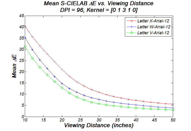
Does color artifacts depend on the shape of the letter? In order to answer this interesting question, I ran a few experiments on selected letters rendered with filter kernel [0 1 3 1 0] on a 96-DPI LCD. I first compared V-Arial-12 and X-Arial-12, since they are both composed of two skew lines (different slope). In addition, I examined V-Arial-12 and W-Arial-12, because the latter is double the former shape-wise. Shown in the first graph, it seems that the closer the slope of the line is to one, the more color artifacts introduced. One can also notice that W-Arial-12 appears more colorful than V-Arial-12 does. The colorfulness become irrelevant when the observer moves farther and farther away.
Does curvy letters (i.e. 'O', 'S') introduce more color artifacts than straight-line letter (i.e. 'V', 'W', 'X')? In order to answer this question, I compared S-Arial-12 and X-Arial-12 shown in the following graph. It seems that curvy letters are a little better than the straight-line letters.
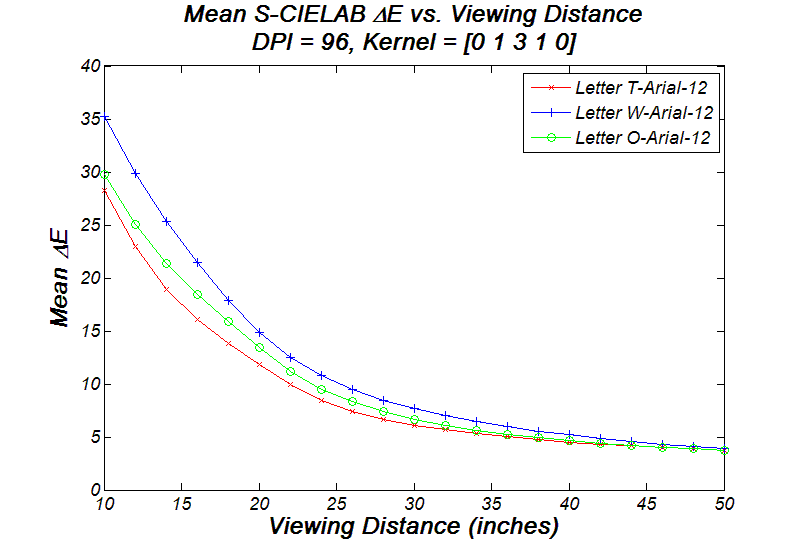
Another quick comparison between the straight-line letter (T-Arial-12), the skew-line letter (W-Arial-12), and the curvy letter (O-Arial-12). The graph suggests that curvy letter has the least colorfulness while skew-line letter has the most.
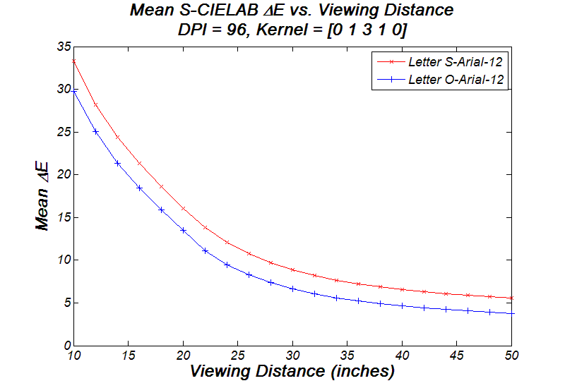
Another experiment to compare two curvy letters: O-Arial-12 and S-Arial-12. The bigger the arc radius of the curve is, the less color artifacts is introduced. There would be more comparisons on this topic. Again, as one moves farther away, these letters become heavier weights and the color artifacts become negligible.
[TOP] DPI Viewing Distance Letter Shape Font Size Font Family Filter Kernel LCD subpixel structure [TOP]
Intuitively, the larger size the font is, the less colorfulness it'll appear. I examined the letter S-Arial-12 and W-Arial-12 on the same 72 DPI LCD. They are rendered with filter kernel [0 1 3 1 0] and observed at 18 inches away. From the result, we can see a slowing decaying trend of the colorfulness. As the font size increases, color artifacts around both letters becomes less and less noticeable due to the heavier weights of the fonts themselves.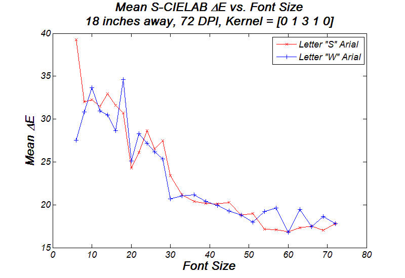
[TOP] DPI Viewing Distance Letter Shape Font Size Font Family Filter Kernel LCD subpixel structure [TOP]
Different font families have their own characteristics, i.e. sharper edges, heavier weights, variable width, etc. I examined the two most popular font families on Windows systems: Times New Roman and Arial. I simulated letter S from each family and record the mean Delta-E value as varying the font size. The graph implies that S-Times-n introduces a little bit more color artifacts than what S-Arial-n does. My understanding of it comes from the tradeoffs between sharper edge and colorfulness. In order to keep the sharpness of S-Times-n, a bit more colorfulness is introduced than it is for S-Arial-n.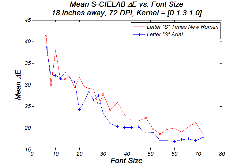
[TOP] DPI Viewing Distance Letter Shape Font Size Font Family Filter Kernel LCD subpixel structure [TOP]
So far, we concluded that DPI is a key determinate factor in the amount of colorfulness being introduced. What about the filtering process in ClearType? Filter kernel should be another key factor in determining the colorfulness. In this experiment, I plot the RMS S-CIELAB Delta-E value versus various DPI. I used three different filter kernels: [0 0 1 0 0], [0 1 3 1 0], and [1 2 3 2 1] to filter the letter S-Arial-12, which are again observed 18 inches away. As shown in the graph, the color filter kernel [0 0 1 0 0] introduces the most color artifacts to the fonts out of the three, while the other two have very close performance. It seems that the wider the kernel spreads, the less colorfulness is introduced. As DPI increases, the color artifacts becomes more and more irrelevant, which converge into the same value eventually.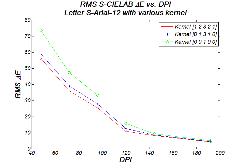
[TOP] DPI Viewing Distance Letter Shape Font Size Font Family Filter Kernel LCD subpixel structure [TOP]
I also tried to show the same ClearType fonts on LCD with different sub-pixel structure (RGB, BRG, or horizontal RGB). The following is a plot of the mean SIELAB Delta-E value versus DPI, letter S-Arial-12 observed at 18 inches away. It suggests that the amount of the colorfulness introduce are approximately the same, which is due to the symmetric filter kernel I chose.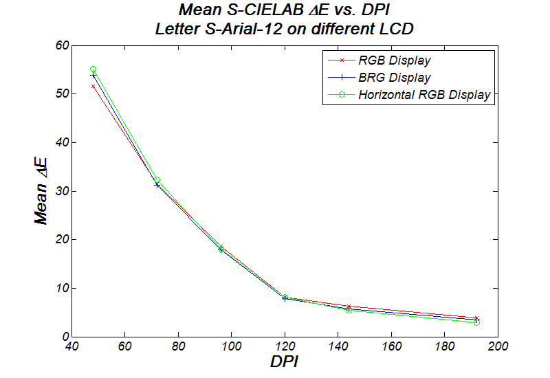
| Introduction | Methods | Results | Conclusions | References | Appendix |
© 2007 jiajing