Localized Noise Power Spectrum Analysis
PSYCH 221: Applied Vision and
Image Engineering – class project
Adam Wang
20 March 2008
Table
of Contents
1.
Introduction
2.
Motivation
3.
NPS Review
4.
Methods
5.
Results
6.
Conclusion
7.
References
Since the 1970s, computed tomography (CT) has
revolutionized medical screening, diagnostics, and treatment with its ability
to non-invasively image the human body. Figure 1 shows a typical CT image of a
human abdomen [1] and clearly illustrates structures such as the liver,
kidneys, and spine.
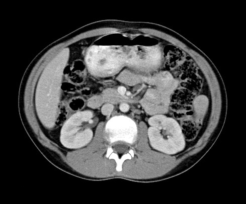
Figure 1. Typical abdomen CT image.
If we are given an unknown object, such an image
cannot be measured or produced directly; instead a series of x-ray measurements
are acquired. Assuming a parallel beam geometry for simplicity, Figure 2a
illustrates one set of measurements called a single view of the object. A
parallel set of x-rays pass through the object, and the x-ray intensities that
are transmitted through the object are measured by an array of detectors. This
is repeated for multiple views as the source and detectors rotate around the
object (Fig. 2b).
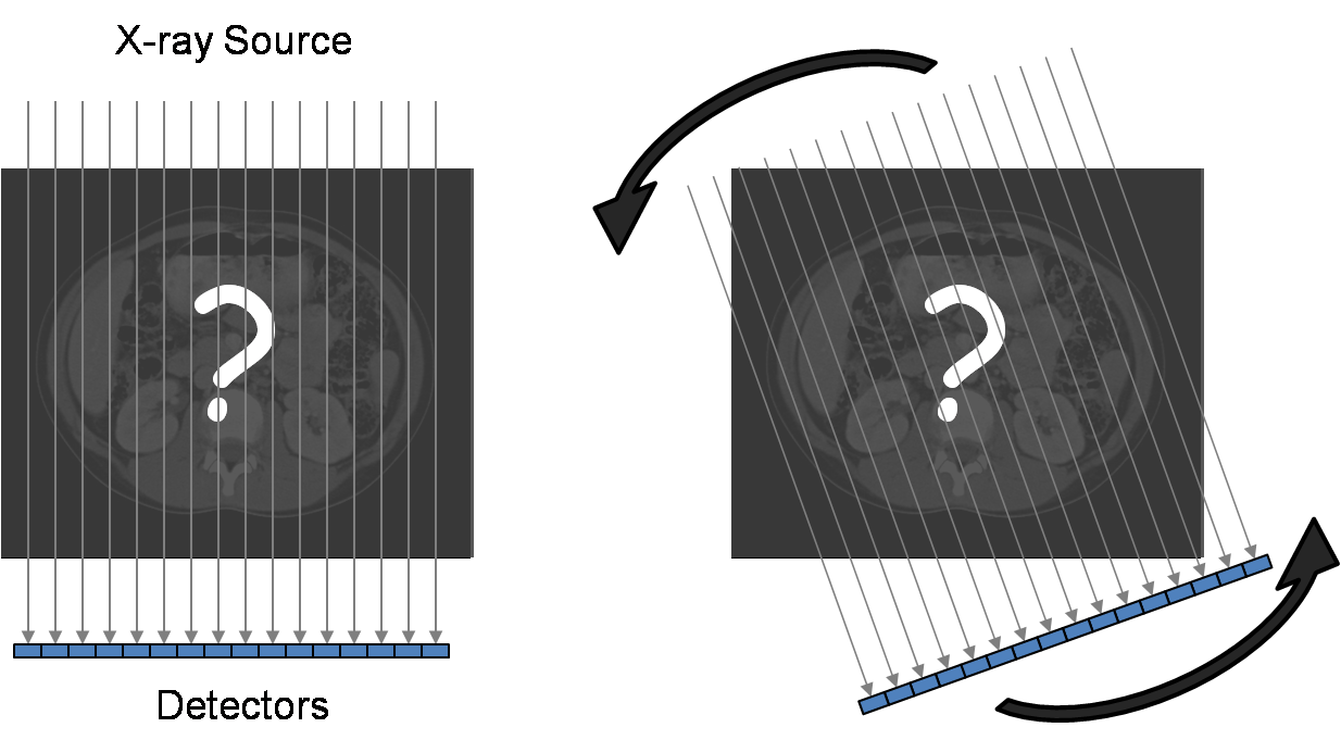
Figure 2. CT data acquisition.
The resulting data is referred to as the raw data
and as the sinogram when displayed.
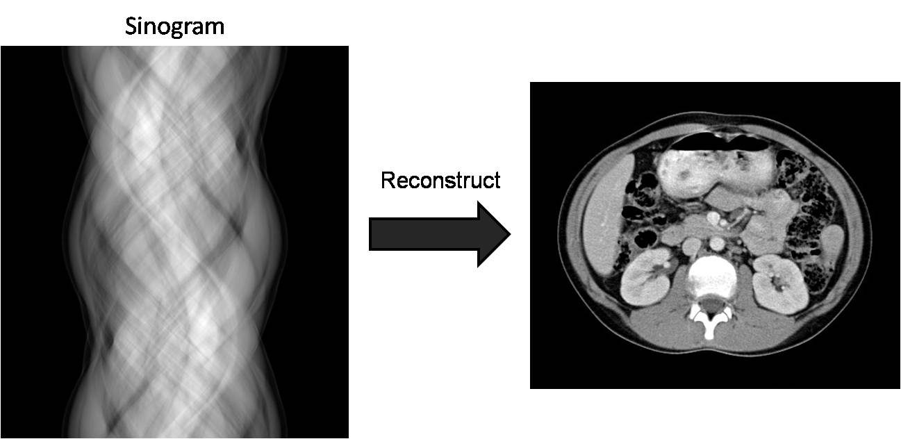
Figure 3. Reconstruction algorithms convert raw data
(sinogram) to an image of the object.
Each row of the sinogram is the detector
measurements from one view. We can clearly see sinusoidal patterns in the
sinogram (hence the name) because the source and detector are rotating about
the object. This raw data must be reconstructed using standard CT
reconstruction algorithms [2] to produce images of the unknown object.
Recent trends in CT such as faster and more
detectors and multiple sources are increasing the raw data size and rate during
an acquisition so much that current data transmission systems may become a
bottleneck. Furthermore, after a reconstruction engine forms a reconstructed
image from the raw data, it is soon discarded, and any additional information
contained within the raw data is lost. While lossy compression of the raw data
is a solution to both problems by reducing the data size so that data
transmission and storage is easier, it introduces errors into the raw data, and
thus the reconstructed image. This is important because errors or noise can
adversely affect the diagnostic value of CT images.
In general, it is appropriate to consider noise in
CT images as additive CT noise originating from additive white noise in the
sinogram. This is also an appropriate first-order model for errors introduced
by compression of the raw data, so we will use the terms “error” and “noise”
interchangeably. However, since we have the freedom to choose our compression
technique, we can target and control what types of errors we introduce into the
raw data. One such consideration is the temporal frequency (vertical direction
in the sinogram) of the errors we introduce. Without too much loss of
generality, we consider low, middle, and high frequencies in this direction,
while allowing for all frequencies in the horizontal direction (detector
spatial frequency).
Our previous work [3][4] has shown that this
consideration is significant because errors in the low temporal frequencies
reconstruct as errors in the center of the image (actually, field of view),
whereas errors in the high temporal frequencies reconstruct as errors in the
periphery of the image. We consider the latter case to be an improvement over
the former because most imaging tasks rely much more heavily on the center of
the image. Therefore, not all errors have the same impact, and although it can
be extremely difficult to quantify, we claim that some sinogram errors can be
thought of as better than others because of their effect on the reconstructed
image.
To prevent confusion with all the other frequencies
that will be discussed, we introduce some simplified terminology. A white noise
sinogram can be decomposed into a sum of its low, middle, and high temporal
frequencies (lowest 1/3, middle 1/3, and highest 1/3 of all frequencies up to
the Nyquist frequency, respectively).
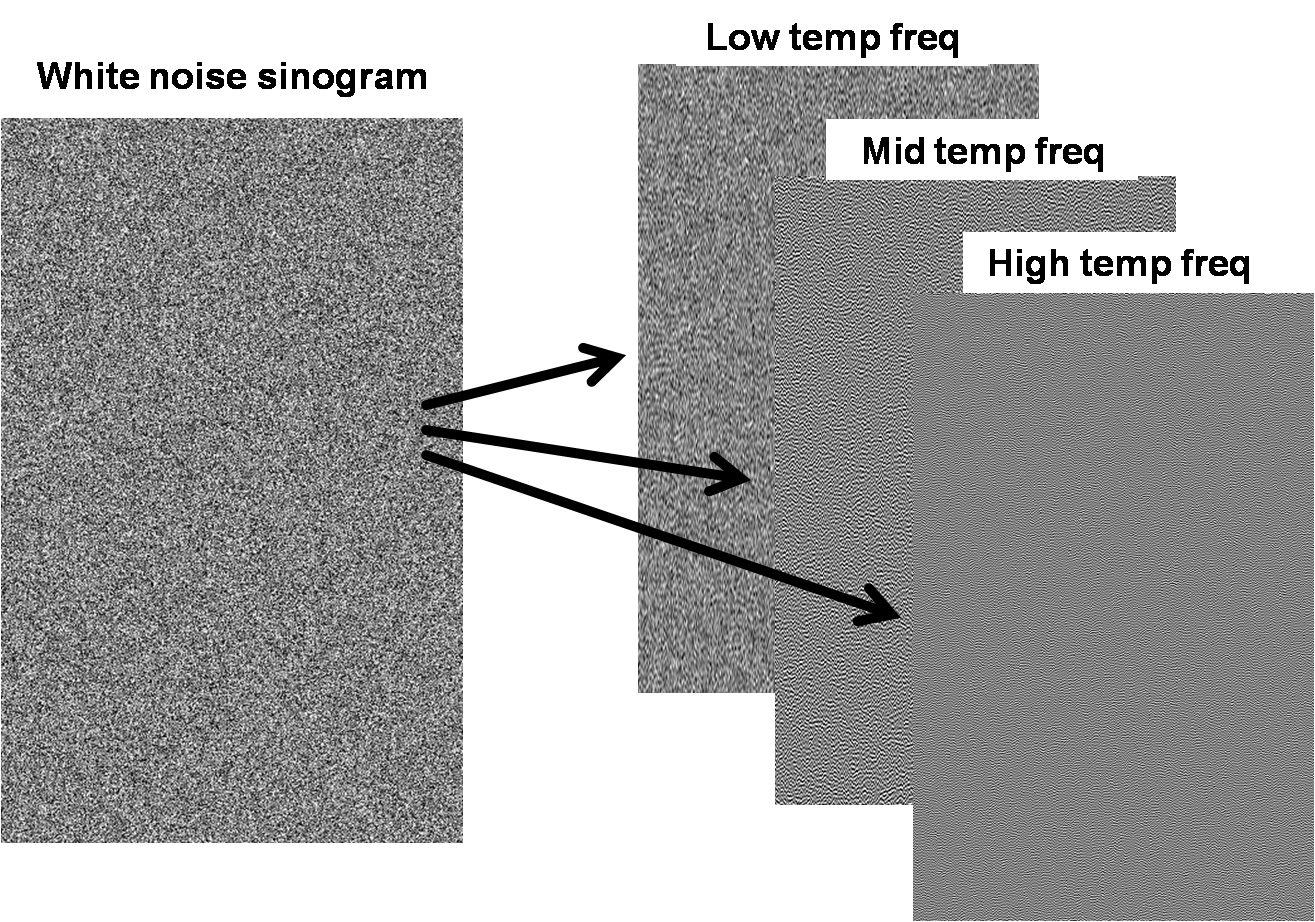
Figure 4. Decomposing white noise into different bands of
vertical frequencies.
Each band can be reconstructed independently to form
what we will call low, middle, and high band images.
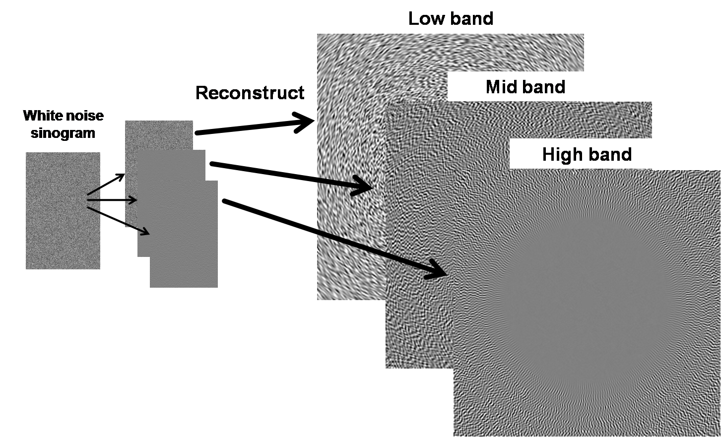
Figure 5. Reconstructing different bands.
Since reconstruction is a linear process, the sum of
these images is equivalent to the reconstructed image of the original white
noise sinogram, and we can consider noise images independently of the object
being imaged because the noise is additive.
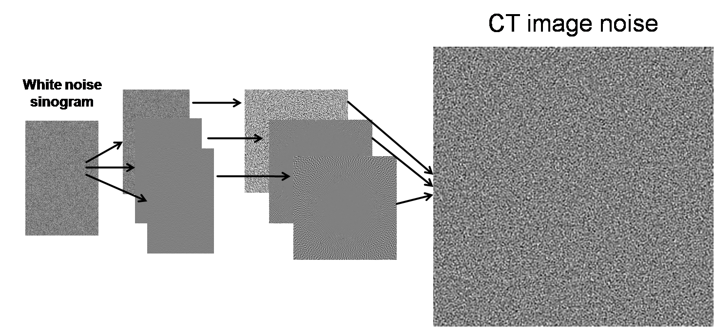
Figure 6. Overall diagram of breakdown of errors into low, middle,
and high bands.
While our previous work analyzed the spatial
dependence of the magnitude of these CT image errors for the low, mid, and high
bands, we have yet to analyze the spatial dependence of the frequency content of
the CT image errors for the various bands. We believe that this could also
determine what types of errors (low, mid, or high band) have the greatest
(negative) impact on the reconstructed image.
Consider a (real) signal g(t) and its Fourier
transform G(f). Then its power spectrum is defined as P(f) = |G(f)|2.
By Parseval’s theorem, the energy of the signal, ![]() , is equivalent to the area under the power spectrum curve,
, is equivalent to the area under the power spectrum curve, ![]() . If our signal is zero-mean noise, we can think of energy as
the mean-squared error (MSE). For a 2D signal or image, g(x, y), we simplify the power spectrum analysis by only considering P(ρ),
where
. If our signal is zero-mean noise, we can think of energy as
the mean-squared error (MSE). For a 2D signal or image, g(x, y), we simplify the power spectrum analysis by only considering P(ρ),
where ![]() and G(kx, ky) is the 2D Fourier transform of g(x, y).
and G(kx, ky) is the 2D Fourier transform of g(x, y).
If a signal gw(t) is white noise, then its values at
different time points are completely uncorrelated. In other words, in order to
generate a zero-mean white noise signal, we take independent realizations of
zero-mean identical distributions, such as a zero-mean normal distribution. The
power spectrum of white noise is constant: Pw(f) = c.
Since power spectrum is a function of (signal) frequency, its equivalent color
can be described as if P(f) were a light wavelength distribution
as a function of (light) frequency [5]. Therefore, if P(f) is flat, it has
power at all wavelengths and is thus called “white”.
Filtering gw(t) with h(t) produces a noise
signal with Fourier transform H(f)Gw(f), so its power spectrum is P(f)
= |H(f)|2|Gw(f)|2 = c |H(f)|2.
Therefore, |H(f)|2 determines the shape of the noise power spectrum
(NPS) and any desired NPS can be achieved by filtering white noise (createNoise.m).
Figure 7 illustrates three types of common noise
colors and their noise power spectra. All three images have the same noise
energy, but have different NPS characteristics. Red noise is dominated by low
frequency noise (analogously, red light is dominated by long wavelength, or low
frequency, photons), and blue noise is dominated by high frequency noise (blue
light is dominated by short wavelength, or high frequency, photons). As we will
see later, noise in a CT image resembles blue noise.
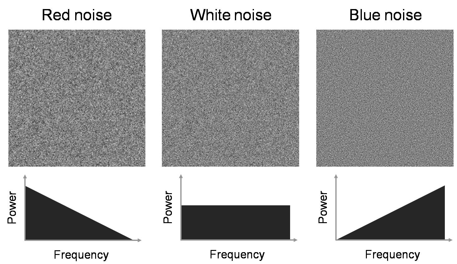
Figure 7. Images of colored noise and their associated noise
power spectra.
We first confirm that the color of noise can impact
the detectability of objects in an image dominated by noise. One of the common
tasks of radiologists using CT is to identify tumors, such as the one in Figure
8, annotated by a black arrow [6]. The tumor is a small round object that is
slightly brighter than the background liver tissue. Because it is not texture
but a uniform increase in signal that defines the tumor, it consists of mostly
low frequencies. Therefore, filtering away high frequencies would not
significantly reduce the visibility of the tumor, but it could filter away
undesired noise. To test the difference this has on different colors of noise,
we “hide” a tumor-like object in a uniform background by injecting enough white
or blue noise so that the object is lost among the noise. A video was created
in Matlab to illustrate our ability to find this tumor as the image is
increasingly blurred by a low-pass filter (createNoiseMovie.m).
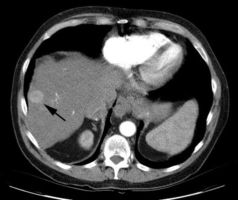
Figure 8. Subtle liver tumor.
Matlab’s Signal Processing Toolbox enables us to
simulate raw data acquisition and image reconstruction. However, Matlab’s
reconstruction algorithm uses interpolation methods (nearest-neighbor, linear,
etc) that limit the frequency response of the reconstructed image, so this has
been modified to perform ‘sinc’ interpolation (iradon2.m).
We examine several methods for evaluating localized
noise power spectra – the noise characteristics in a small region of interest
of an image. The simplest method to analyze frequency content as a function of
space is a Short-Term Fourier Transform (STFT), which performs a Fourier
transform of a small window around any spatial location. We also implement and
investigate the newly developed Stockwell Transform, which gives the
instantaneous frequency response for every single point in a signal. Finally,
we apply the Wavelet Transform, which enables us to nicely visualize any
spatially-dependent noise power spectrum.
The 2D Stockwell transform of image g(x,
y) is defined as ![]() [7]. Therefore, for
all points (x, y) in the image, we get the full instantaneous spectrum (kx, ky). The term
[7]. Therefore, for
all points (x, y) in the image, we get the full instantaneous spectrum (kx, ky). The term ![]() can be thought of as a
Gaussian window that changes position with spatial location (x, y)
and shape with spatial frequencies (kx,
ky), while the
can be thought of as a
Gaussian window that changes position with spatial location (x, y)
and shape with spatial frequencies (kx,
ky), while the ![]() term is just the normal 2D Fourier transform. One nice
property about the Stockwell transform is that its integral over all of space
yields the 2D Fourier transform:
term is just the normal 2D Fourier transform. One nice
property about the Stockwell transform is that its integral over all of space
yields the 2D Fourier transform: ![]() . The 1D and 2D discrete versions of the Stockwell transform
were implemented as described in [8] and [9], respectively (st1d.m, st2d.m).
. The 1D and 2D discrete versions of the Stockwell transform
were implemented as described in [8] and [9], respectively (st1d.m, st2d.m).
While the STFT and Stockwell Transform are useful
tools, neither directly enables the simultaneous visualization of both space
and frequency of a 2D image since they produce 4D data (2D frequency as a
function of 2D space). All data from a wavelet decomposition, on the other
hand, can be arranged to illustrate both space and frequency in an easy-to-read
fashion, as described by the mandrill example below. When the coefficients of
the wavelet transform are displayed in the manner, the subblocks in the top
left correspond to lower frequencies whereas the subblocks toward the bottom
correspond to higher vertical frequencies and those toward the right correspond
to higher horizontal frequencies.
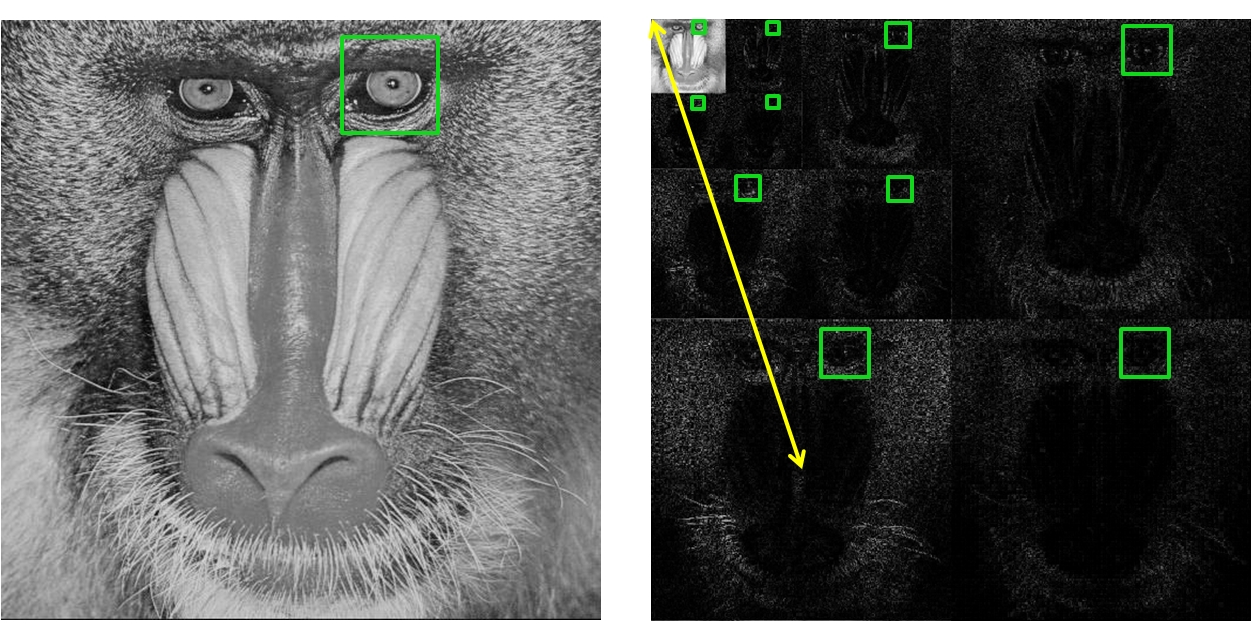
Figure 9. Mandrill image (left) and its 3-level 2D wavelet
decomposition (right).
To perform localized NPS analysis with the
Daubechies wavelet transform, we first take the square of the wavelet
coefficients to get “wavelet power”. Since the sum of the wavelet power is
equivalent to the image energy [10], this is an appropriate equivalent to the
power spectrum in Fourier space. Each subblock of the wavelet power is a scaled
and filtered version of the image, so if we consider a region of interest in
the image with a square window of size Ws
= 2n, then we can do an n-level 2D wavelet decomposition where
each subblock has a corresponding window for the region of interest in the
image. This is illustrated in the above figure, where our region of interest is
the mandrill’s left eye. The window size of each subblock is Ws/2level # and is
centered on the mandrill’s left eye in each subblock. We consider the
representative frequency of each subblock to be proportional to the distance
from the top left corner to the center of the subblock, as shown by the yellow
line for the bottom left subblock. To create a local NPS profile, we plot the
average power in each scaled window against the representative frequency of the
window’s subblock. This was implemented in NPS_ROI.m.
To obtain a good representation of wavelet power, we
averaged the wavelet power of 200 realizations of CT noise, low band, mid band,
and high band reconstructed images. For each realization, a white noise
sinogram was generated and then reconstructed. Similarly, the white noise
sinogram was filtered by each of the low, mid, and high bands, and each was
reconstructed.
We start with a tumor-like object that is brighter
than a uniform background.

Figure 10. Simulated tumor.
Then we add either white noise or blue noise with
the same energy to the image.
Tumor +
White Noise Tumor
+ Blue Noise
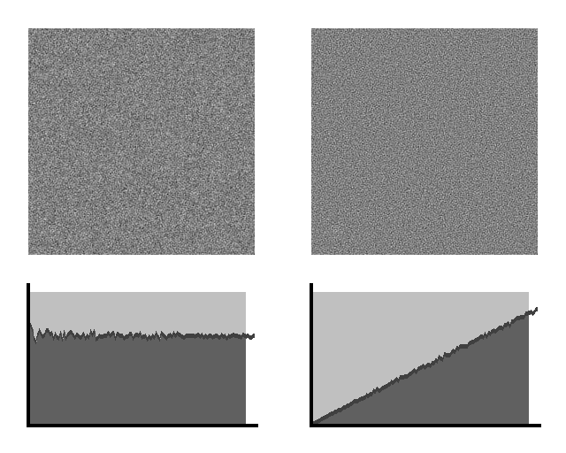
Figure 11. Simulated tumor masked by white (left) and blue
(right) noise.
As we begin to blur the image with a low-pass
filter, we can see that the amount of noise decreases until the tumor hidden by
the blue noise becomes apparent. Because most of the tumor’s energy is in low
frequencies, it still remains in the image as we filter away noise. The plots
of NPS make it clear that low-pass filtering is much more advantageous for
removing blue noise than white noise. No amount of blurring can help us find
the object in white noise because the NPS is flat, whereas blurring enables us
to find the tumor in blue noise. While the tumor is present in all of the
filtered white noise images, numerous ambiguities exist in the tumor-detection
task. Therefore, for such tasks, having blue noise is better than having white
noise because most of the blue noise power is in the higher frequencies.
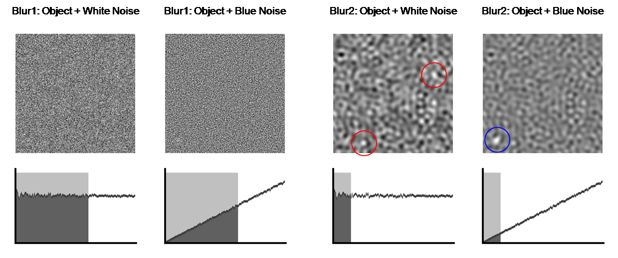
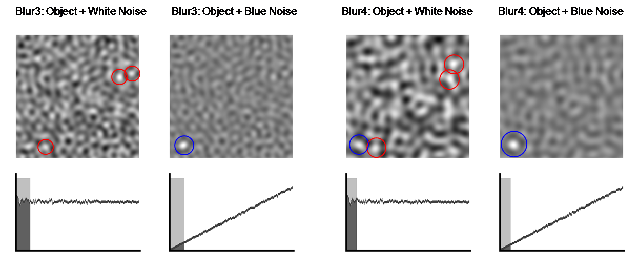
Figure 12. Blurring makes tumor detection easier. The blue
circles indicate the correctly identified tumor, whereas the red circles
indicate multiple ambiguities.
Despite its use by some groups analyzing medical
images [9], our results show that the Stockwell transform has some flaws when
applied to noise. For simplicity, we only consider the 1D Stockwell transform,
although the same results hold for the 2D Stockwell transform.
First, we demonstrate that the Stockwell transform
is a valid approach to general time-frequency analysis. Consider the signal
below on the left, which is characterized by a low frequency sinusoid (f = .05 Hz) in the first half and a high
frequency sinusoid (f = .2 Hz) in the
second half. There is also a burst of high frequency (f = .4 Hz) between time t
= 20s and t = 30s. The magnitude of
its (complex) Stockwell transform is on the right, clearly showing excellent
agreement with the description of the signal and a sharp differentiation of the
different frequency components.
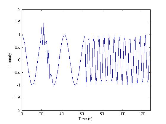
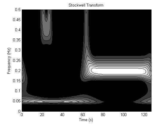
Figure 13. Stockwell transform (right) of time signal (left).
However, if we try to apply the Stockwell transform
to white noise, the result is not useful for our purposes. To illustrate this
we average the magnitude of the Stockwell transform of 1000 realizations of
white noise. We would like to see the frequency spectrum to be flat for each
time point, and thus constant for the entire image representation, but instead
we get a drop-off at lower frequencies. This drop-off is caused by the Gaussian
windowing term that can be better understood if we express the Stockwell
transform as ![]() . Here, G(kx, ky) is the Fourier transform of the image g(x,
y). The Gaussian term
. Here, G(kx, ky) is the Fourier transform of the image g(x,
y). The Gaussian term ![]() always has a maximum height of 1, but broadens with larger (kx, ky) and narrows to an impulse as (kx, ky)
à 0. The
always has a maximum height of 1, but broadens with larger (kx, ky) and narrows to an impulse as (kx, ky)
à 0. The ![]() term is the inverse Fourier transform of the
shifted Fourier transform. Therefore, for higher frequencies, the broad
Gaussian term has more area under its curve than for lower frequencies, so the
Stockwell transform will have higher signal at higher frequencies than lower
frequencies. This drop-off does not exist for the STFT or Wavelet transform
because the coefficients of white noise decomposed into orthonormal components
will also be white.
term is the inverse Fourier transform of the
shifted Fourier transform. Therefore, for higher frequencies, the broad
Gaussian term has more area under its curve than for lower frequencies, so the
Stockwell transform will have higher signal at higher frequencies than lower
frequencies. This drop-off does not exist for the STFT or Wavelet transform
because the coefficients of white noise decomposed into orthonormal components
will also be white.
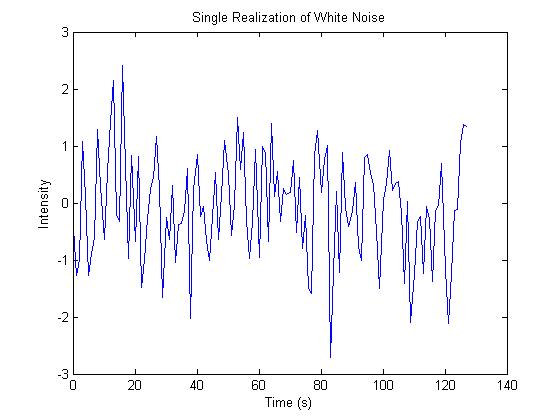
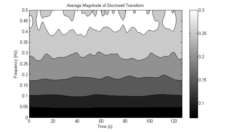
Figure 14. Stockwell Transform of white noise does not produce
a flat spectrum.
Further difficulties were encountered with the 2D
Stockwell transform due to its immense memory and computational requirements.
Because the implementation requires O(N4) memory and O(N4logN) computation time for a NxN
image [9], images beyond size 100x100 could not be reasonably handled by normal
PCs. Even our sub-sampled implementation of the 2D Stockwell transform,
although cutting down on the memory requirements, still required the same
computation time. Therefore, it was decided that the Stockwell transform was
not a reasonable approach for our problem. Nonetheless, the 1D, 2D, and 2D
sub-sampled Stockwell transforms were implemented in Matlab, and their code is
included in the Appendix (st1d.m, st2d.m, st2d_sub.m, st_example.m).
In the figure below, the left image is one realization
of CT noise. The right image is the average wavelet power over 200 realization
of CT noise. We ignore the highest frequency subband of the wavelet transform
(lower right block) because its frequencies are primarily outside the frequency
response of the CT reconstruction algorithm. The wavelet power very nicely
shows us that within each subblock, the frequency response is constant across
the image, and that decreasing frequencies (moving up and left) have less
wavelet power. If we take a region of interest (ROI) in the center denoted by
the red window, we see that the NPS in that region is as we expect, like blue
noise. An edge ROI denoted by the blue window produces a similar NPS, showing
that the NPS is stationary across the image. All NPS plots are shown on the
same scale, unless indicated otherwise.
CT Noise
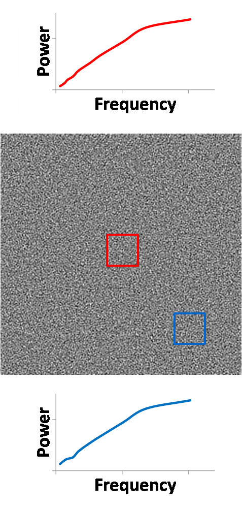
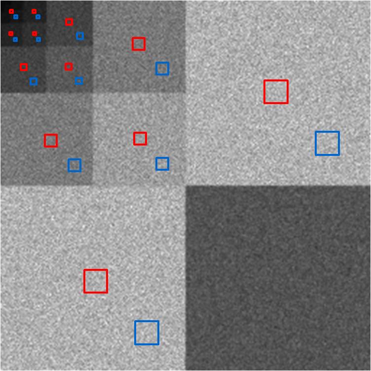
Figure 15. Wavelet power (right) of CT noise (left) enables
localized NPS analysis.
Our results become more interesting when we examine
the three bands of noise. The wavelet power image demonstrates that the low
band’s noise energy is primarily in the center of the image. In fact, the red,
center ROI of the image shows that the NPS at the center of the low band image
is much like CT noise in shape and power levels. However, at the blue, edge
ROI, the local NPS has lost much of its high frequency content, while it still
has just as much low frequency noise. While less high frequency noise is good,
we still have the low frequency noise, which as shown before, is a bigger
problem for tumor-detection tasks. If we look at the periphery of the low band
noise image, we see blurring in the radial direction, and this is captured well
in the wavelet power. For instance, at the top center of the image, the
blurring is primarily in the horizontal direction, and we see this as a void of
energy at the top center of the top right subblock of the wavelet power image,
whereas there is still substantial energy in the vertical direction, as shown
at the top center of the bottom left subblock of the wavelet power image.
Low Band
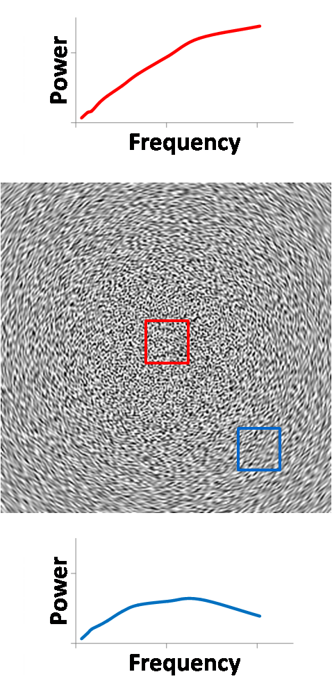
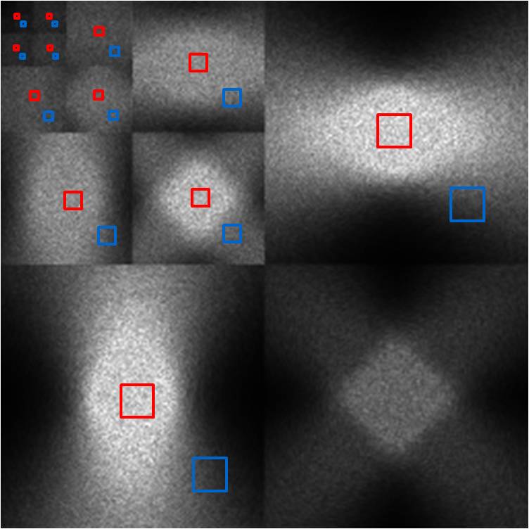
Figure 16. Wavelet power (right) of low band image (left).
The reconstructed image of mid band noise has a characteristic
void of noise energy in the center region. This manifests itself very clearly
in the wavelet power image, as all subblocks demonstrate this void in the
center. Nonetheless, there is still some energy at the center, and after
magnifying the power scale by 5000x, we see that the shape of the spectrum is
far from blue noise. However, the sheer magnitude of suppression of noise
energy in this region mitigates any such concern. At the edge region, the local
NPS shows that overall noise power is scaled down by a factor of 2 and is more
“blue” than CT noise in the sense that its spectrum is more dominated by higher
frequencies.
Mid Band
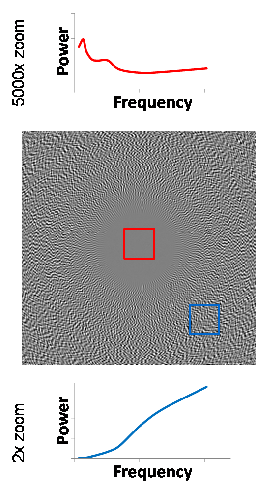
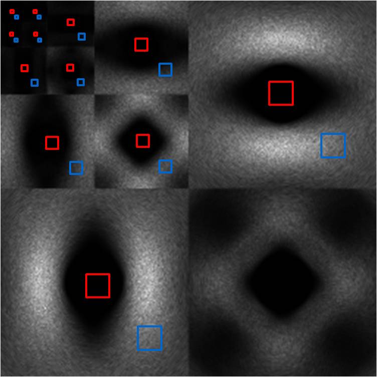
Figure 17. Wavelet power (right) of mid band image (left).
The high band noise is an even more extreme version
of the mid band noise. The central void is even larger, and the edge NPS is
even more highly concentrated in the high frequencies. This is very apparent in
the wavelet power image, which shows that the noise power cannot be seen after
the second-level decomposition. Thus, low frequency noise is not significant
throughout the entire image, and the only noise we have (if any at all) is high
frequency.
High Band
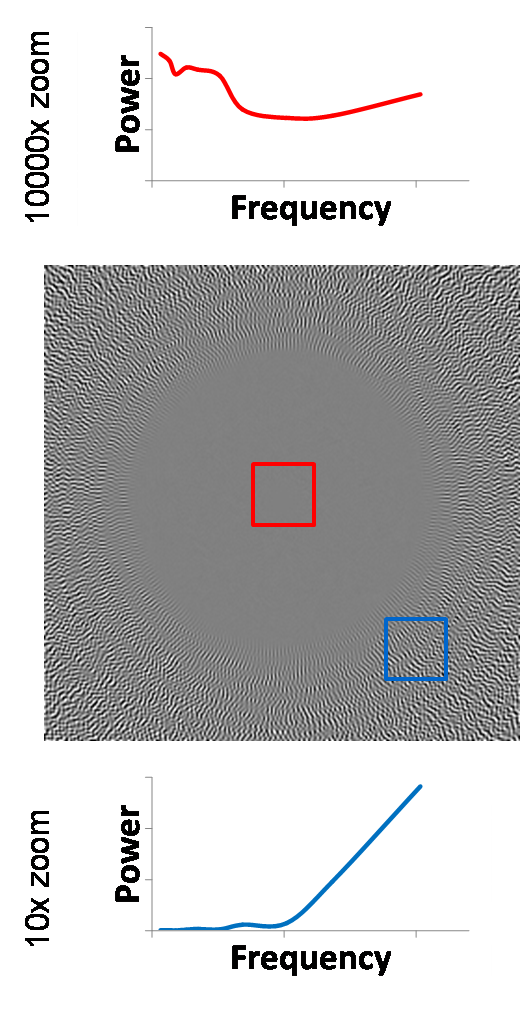
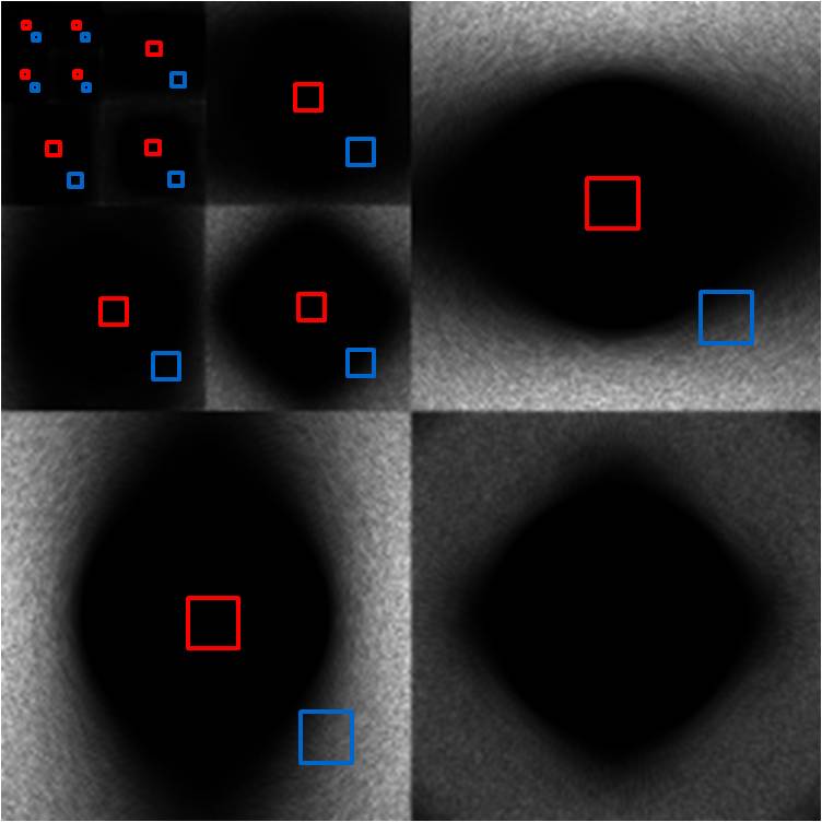
Figure 18. Wavelet power (right) of high band image (left).
The final comparison of the images from the low,
mid, and high bands at a center ROI and an edge ROI is shown below. Our
previous work has already shown the increasing void in the center of the image as
we move to higher bands. Again, this is seen as beneficial because usually the
clinical region of interest is at the center of the image, not at the edge. But
we now see that even if we had to sacrifice a 5-fold increase in high band
noise power to sequester the low band noise, we would not be affected in the
center of the image (2000x reduction of noise power instead of 10000x), and
although now the NPS at the edge of the high band would be on the same scale as
that of the low band, we still have the additional benefit of it being
dominated by high frequency noise.
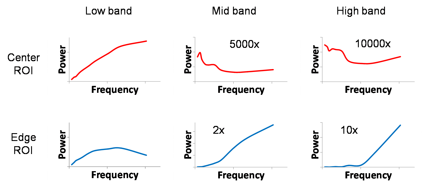
Figure 19. Side-by-side comparison of local NPS for low, mid,
and high band images.
Our results have shown that for certain tasks such
as tumor detection, image noise color affects an ideal-observer’s performance
(whether or not a human observer would actually do better is another matter).
When doing time-frequency analysis the Stockwell transform gives a wealth of
information, but is a poor choice for both analyzing noise power spectra and
analyzing large images. The wavelet transform is useful in both visualizing and
discerning localized frequency content of noise and has shown us that higher
temporal frequencies in the sinogram (high band) are a win-win situation due to
the void of errors in the center of the image and push of noise power to higher
frequencies where the errors are significant at the edge of the image.
[1] University
of Kansas Hospital – Nuclear Medicine. http://www.rad.kumc.edu/nucmed/images/pet/lymphoma_ct_abdomen2_0304.jpg.
Accessed 17 March 2008.
[2] A.
C. Kak and Malcolm Slaney, Principles of Computerized Tomographic Imaging, IEEE
Press, 1988.
[3] A.
S. Wang, Y. Xie, and N. J. Pelc, “Effect of the Frequency Content and Spatial
Location of Raw Data Errors on CT Images,” Vol. 6913 of Medical Imaging 2008: Physics of Medical Imaging. Proc. of SPIE,
2008, in press.
[4] Y.
Xie, A. S. Wang, and N.J. Pelc, “Lossy Raw Data Compression in Computed
Tomography with Noise Shaping to Control Image Effects,” Vol. 6913 of Medical Imaging 2008: Physics of Medical
Imaging. Proc. of SPIE, 2008, in
press.
[5] Wikipedia,
“Colors of Noise,” http://en.wikipedia.org/wiki/Colors_of_noise.
Accessed 12 March 2008.
[6] Radiofrequency
Ablation, Massachusetts General Hospital, “Liver Tumor Before RF Ablation,” http://www.massgeneralimaging.org/RFA_Site/NewFiles/CaseStudies.html.
Accessed 17 March 2008.
[7] L.
Mansinha, R. G. Stockwell, R. P. Lowe, M. Eramian, R. A. Schincariol, “Local
S-spectrum Analysis of 1-D and 2-D Data,” Physics
of the Earth and Planetary Interiors 103 (1997) 329-336.
[8] R.
G. Stockwell, L. Mansinha, and R. P. Lowe, “Localization of the Complex
Spectrum: The S Transform,” IEEE
Transactions on Signal Processing, Vol. 44, No. 4, April 1996.
[9] R.
A. Brown, H. Zhu, J. R. Mitchell, “Distributed Vector Processing of a New Local
MultiScale Fourier Transform for Medical Imaging Applications,” IEEE Trans. on Medical Imaging, Vol. 24,
No. 5, May 2005.
[10] I.
Daubechies, Ten lectures on wavelets,
CBMS-NSF conference series in applied mathematics. SIAM Ed (1992).
8. Appendix – Code
and Files
The following code and files are everything you need
to reproduce the work here! Support .m files and images provide further
examples on CT and image processing. All code was written by me unless
otherwise noted.
createNoise.m Code
to create the colored noise and spectra of Fig. 7.
createNoiseMovie.m Code to create movies of blurring white and blue noise that
masks an object. Figures 10-12 come from here.
iradon2.m Modified
inverse radon transform (MATLAB) to reconstruct CT images. Adds ‘sinc’
interpolation for better reconstruction frequency response.
localNPS_CTnoise.m Produces ‘Wavelet NPS Analysis’ results by generating CT
noise, low band, mid band, and high band images and finding wavelet power.
NPS_ROI.m Finds
the NPS of an ROI based on wavelet decomposition, given an image and window.
st1d.m 1D
Stockwell transform implementation.
st2d.m 2D
Stockwell transform implementation.
st2d_sub.m Sub-sampled
2D Stockwell transform implementation to reduce memory requirements.
st_example.m Produces
‘Stockwell Transform’ results by generating test signals and their Stockwell
transforms.
Support .m files
and images (including Wavelet library written by Miki Lustig)