The Napolean Cake: How Well Is Spatial Frequency Preserved?
![]()
Observation | Evaluation Techniques | Analysis | Conclusion
We were somewhat surprised to find such a wide variance of discrepancy in the reconstruction of our spatial frequency images. Some photos were quite accurate in representing the original image, having only slight intensity differences and minor glitches here and there. Others, however, were way off the mark, providing aliased images with almost random frequency patterns. The following is the table containing the original and returned test patterns:
Observation | Evaluation Techniques | Analysis | Conclusion
Studying the spatial frequency patterns accurately on a quantitative level proved to be hard for a number of key reasons:
Scanner - though the scanner does an adequate job of scanning in the photo, the scanner's scan rate also adds its own form of aliasing to the final image, making results possibly inaccurate. In addition, no matter how hard we tried, the scanner would inadvertently blur the photo by a small amount. This is evident in the scanned images of the checkerboard, where the 4 scanned images are slightly blurrier than the test image. The original photos, however, did not suffer from this problem.
Orientation - though we tried many times, it was extremely hard to get the scanner to orient the picture at a perfect 90 degree angle. As a result, the scanned images were often rotated by 1 or 2 degrees. While this does not pose a significant problem for the color and noise studies, it seriously complicates the spatial frequency studies, since position in relation to the 4x6" area is very important. We tried scanning the pictures in first on an HP Photo Scanner, which consistently misaligned the image, then on a Canon FB 620U flatbed scanner, which produced better results, but still had slight orientation problems.
Sizing and Position - though the pictures we submitted were 1200x1800, or 4x6 assuming a 300ppi resolution, the returned pictures were slightly smaller than that, possibly due to the cutting process of the photographic paper. As a result, the final scanned image and the test image do not correlate perfectly in terms of size and position. This can be seen with the checkerboard pattern photos, where the fringe squares have been clipped and don't match the test image completely.
While these problems don't hinder color and noise studies all that much, they become very important with spatial frequency, as matching pixel location with the test image is imperative in order to provide an accurate analysis of the photo. Given the sheer amount of data, rather than try to "fix" the images, we opted to assume that problems would apply across the entire range of images, and so we tended to focus more on differences between the photos, rather than directly comparing the photos with the test image.
Complications aside, the main thing we were looking for is how accurately does the print reproduce the sinusoidal patterns of each of the test images? True, images might be darker, or have less sharply defined peaks and troughs, but if they look similar to the original, then for the most part they've successfully reproduced the images. However, the issue arose from our studies, that the best looking image doesn't necessarily correlate the best to the sinusoidal data of our test images.
In evaluating the images, we did not try to calibrate the scanners to fit the intensities of the test image. Doing so might weigh accuracy in the favor of one particular image at the expense of lost accuracy with other images. We assumed that the scanner distortion was consistently linear throughout all images, and that differences we find between images would be a product of the photo, not the scanner.
We collected data for each set in the following manner:
Horizontal Sin Pattern - We took each column of pixels across the 1800 pixel width, averaged the values, then plotted the average across the width. This helped to eliminate any stray errors that might come up, and helped to reduce some of the problems we had above.
Matlab function | Matlab run function
45 Degree Sin Pattern - For this, we just took a cross section of the image at a row 500 pixels down for each scan.
Matlab function | Matlab run function
Horizontal Rect Function Pattern - We performed this in exactly the same way as the Sin pattern.
Matlab function | Matlab run function
45 Degree Horizontal Rect Function Pattern - We performed this in exactly the same way as the 45 Degree Sin Pattern.
Matlab function | Matlab run function
Vertical Rect Func Pattern - We traversed the rows this time, instead of the columns, and did the same averaging calculations we did for the horizontal sin and rect patterns. We plotted the results across the height of the image, this time (1200 pixels).
Matlab function | Matlab run function
45 Degree Vertical Rect Pattern - We used the same code as for the 45 Degree Horizontal Rect Function Pattern, taking a cross section of the image at row 500, which was arbitrarily chosen.
Matlab function | Matlab run function
Average of Horizontal and Vertical Rect Patterns and B&W Combined Patterns - We could not think of any easy way to study these quantitatively. The photos we got were noticeably darker than the test image, and they were darkened even more by the scanner. We did make some qualitative judgements on the images, however.
Checkerboard with 60x60 pixel squares - We took a cross section at an arbitrary row of the image, and plotted that.
Matlab function | Matlab run function
Observation | Evaluation Techniques | Analysis | Conclusion
We compared each image with the corresponding test image, and also with each other, in order to find the image that best matches the original. For the graphs, all plots are of intensity plotted over the horizontal pixel width of the image (1800 pixels), unless otherwise noted.
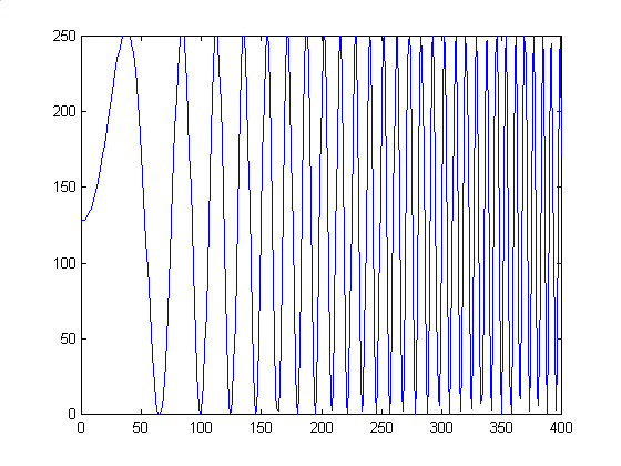
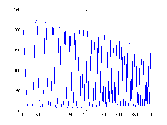
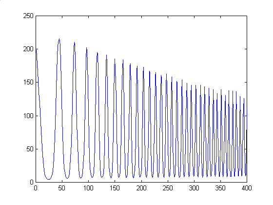
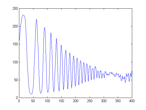
For this image, the original test pattern was primarily just a sinusoid that increased in frequency as we move from left to right. Interestingly enough, though, we got aliasing on our own monitors when we zoom out the 1200x1800 image to about the size of a photograph. Taking a cross section of each from the center row of each image yielded the following plots. We add in a plot of the first 400 pixels, to show the general progression. Plots of the rightmost 400 pixels, where most of the aliasing occurred, was very hard to make, since the intensity of the image shifts every pixel from light to dark, leading to very spiky images. Also, inherent flaws in the test image make it hard to make conclusive judgements about the accuracy of the reproductions.
| Vendor/Type | Averaged Column plot | Zoomed in Plot at 1-400 pixels |
| Original | 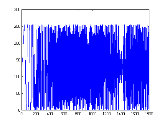 |
 |
| Shutterfly | 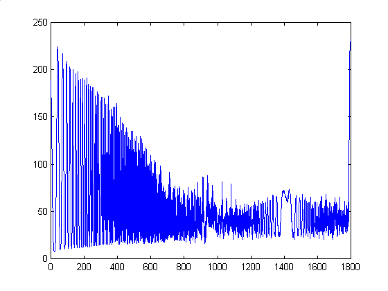 |
 |
| OFoto | 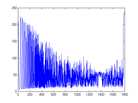 |
 |
| PhotoNet | 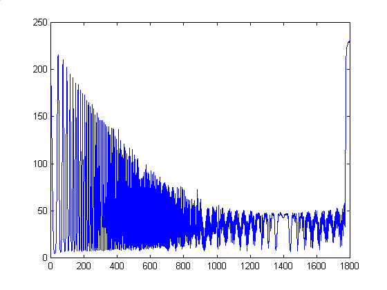 |
 |
| PhotoAccess | 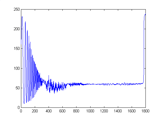 |
 |
First, there seems to be artifacts in our original image, as we see aliasing at higher frequencies. We aren't sure why this is the case, and we found no such aliasing in our other test images. We see that there is a fair amount of discrepancy between the test image plot and the plots of four photos. However, Shutterfly and OFoto yielded similar plots in relation to each other, so it seems that the problems inherent to data collection at least remained consistent across each photo. PhotoNet's plot was very similar to Shutterfly and OFoto's, but has more pronounced peaks and troughs. PhotoAccess was way off in comparison to the other three photos, with a quickly diminishing function that approaches a constant intensity halfway through the image. We can conclude that while Shutterfly, OFoto, and PhotoNet accurately reproduce the original waveform down to the artifacts in the original, PhotoAccess performs additional processing which deforms the curve. A side result of this, however, is that the sampling problems are not as visible as with the other three vendors, and we get a smoother and more visually consistent image.
We didn't get the same aliasing errors as we did for the horizontal sin pattern. For the most part, the printed photos were pretty accurate when compared to the test image. As the graphs below show, although we have slight intensity differences, the differences are consistent across the board.
| Vendor/Type | Cross-sectional plot |
| Original | 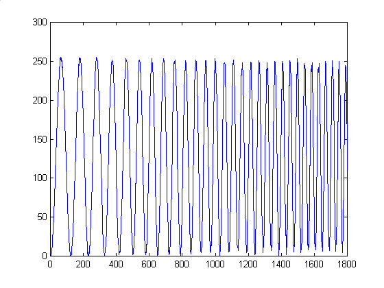 |
| Shutterfly | 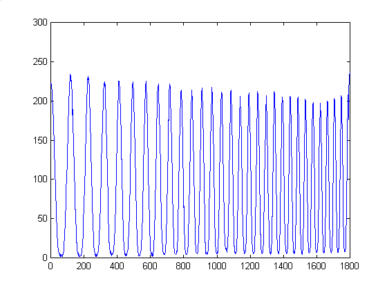 |
| OFoto | 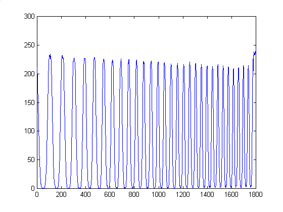 |
| PhotoNet | 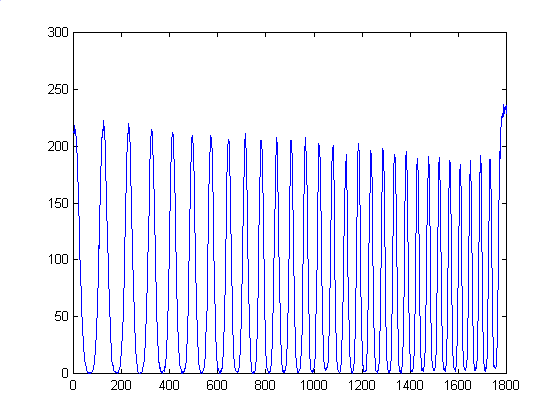 |
| PhotoAccess | 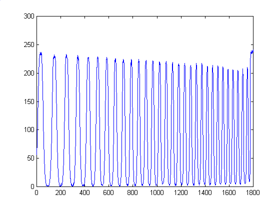 |
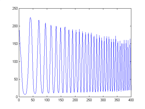
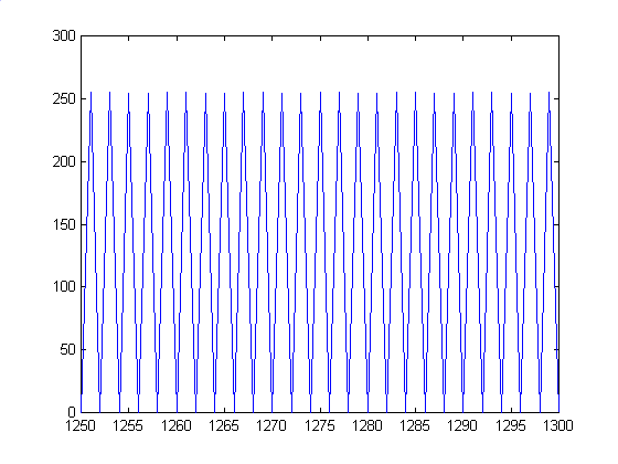
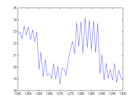
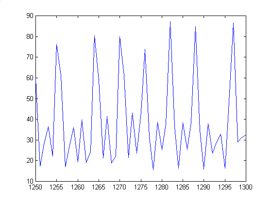
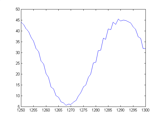
We got results for these similar to the Horizontal Sin wave. While different from the test image curve, there was consistency between the scanned images:
| Vendor/Type | Averaged Column plot | Plot of 1250-1350 pixel range |
| Original |  |
 |
| Shutterfly |  |
 |
| OFoto |  |
 |
| PhotoNet |  |
 |
| PhotoAccess |  |
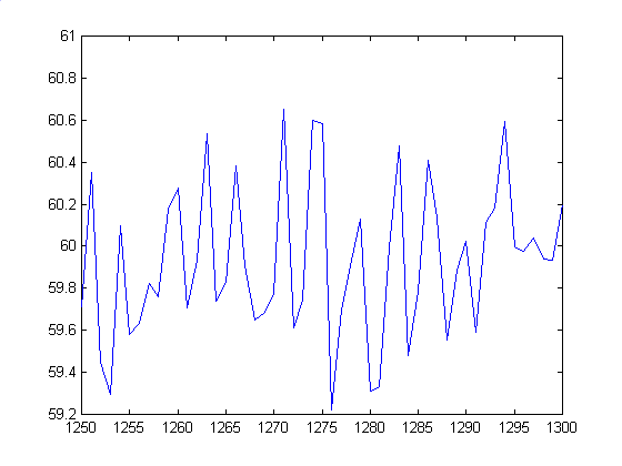 |
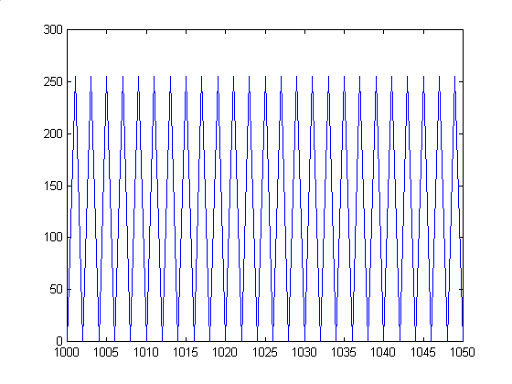
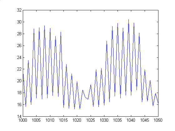
Unlike before, we have some major differences between Shutterfly and OFoto's scans. This time, PhotoNet's scan is more similar to Shutterfly's image at lower frequencies, but at higher, we see that Kodak has wider sinusoids, which implies that they need to sample at a higher rate to eliminate aliasing. As before, PhotoAccess has drastically different plots than the other three, but appears to have a nicer look from an aesthetic standpoint, possibly due to blurring at higher frequencies.
In terms of frequencies, we see the original image correctly shows 1/2 cycle per pixel, or 2 pixels/cycle. Shutterfly seems to change up and down 1 time per pixel, which is correct, but the curve has an overall shape with around 25-30 pixels/cycle. We see similar things for OFoto, which seems to have a better overall shape,. but still falls short of the original. Kodak PhotoNet is way off, with little in the way of peaks, and the curve is around 45 pixels/cycle. The result is smooth looking bands, instead of our naarrow lines. Finally, PhotoAccess seems to remove most of the jaggedness, and instead provides a smoother curve than Shutterfly or OFoto with a frequency of around 4-5 pixels/cycle. Also, note the vertical axes for each photo. The intensity range is MUCH smaller than the original, which makes it harder to see the contrasting black and white in the photos compared to the test image.
45 Degree Horizontal Rect Function
After seeing our results with the 45 Degree Sin Pattern, we expected consistently accurate reproductions of all our angled test patterns. The results from these scans confirmed that as well. Pictures in general were quite good, especially at the lower frequency end. Though some pictures got a little blurry at the higher frequency end, we saw none of the aliasing and random banding we found in the horizontal sin and rect functions.
| Vendor/Type | Cross-sectional plot |
| Original | 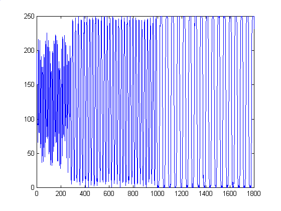 |
| Shutterfly | 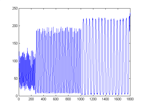 |
| OFoto | 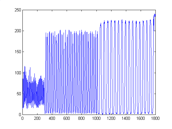 |
| PhotoNet | 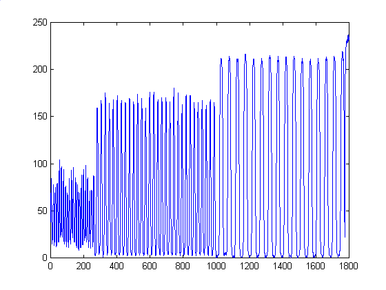 |
| PhotoAccess | 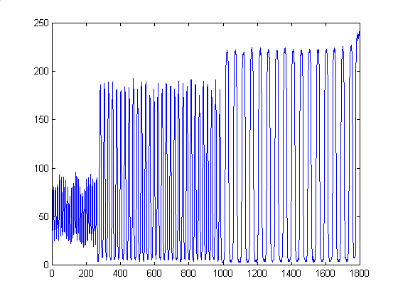 |
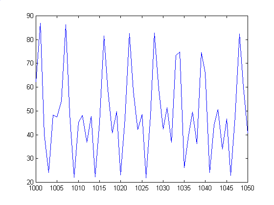
We treated this the same way we treated the horizontal equivalent. Again, we found the same similarities and discrepancies we found with the Horizontal Rect Function case. Shutterfly and Kodak PhotoNet share similar curves at lower frequencies, but Kodak shows wider defined sinusoids at higher frequencies, which implies that Kodak sampled the image at too low a rate. Also, PhotoAccess, who must be using a very different development process, comes up with again a drastically different, more blurred curve, that equates to a less aliased image..
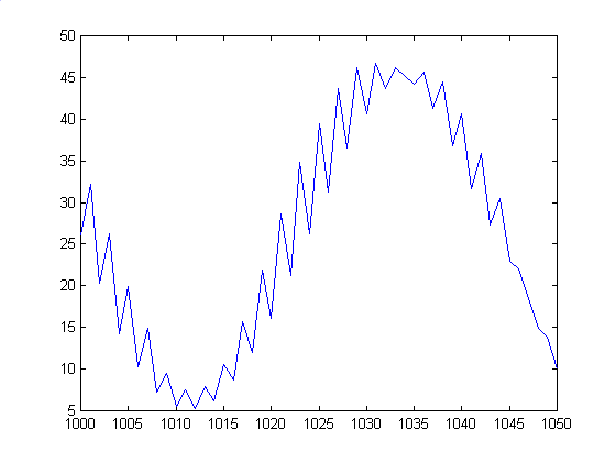
| Vendor/Type | Averaged Row plot | Plot of Pixels 1000 - 1050 |
| Original |  |
 |
| Shutterfly | 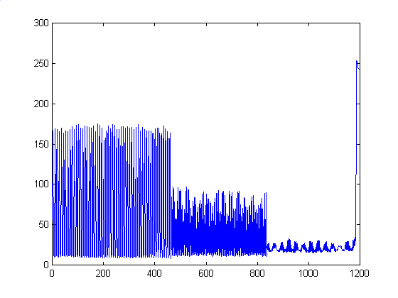 |
 |
| OFoto | 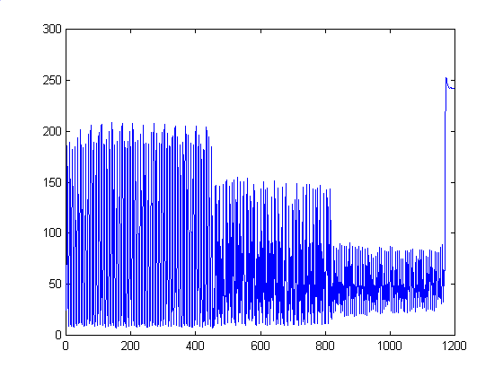 |
 |
| PhotoNet | 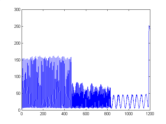 |
 |
| PhotoAccess | 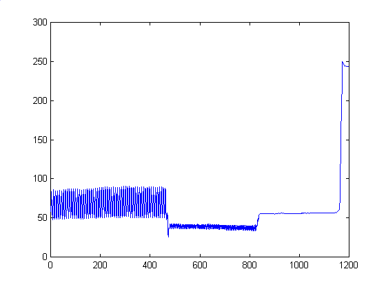 |
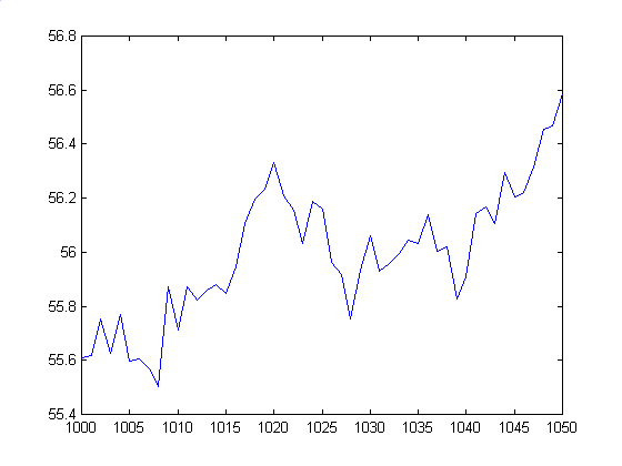 |
Here we see much of the same characteristics as the horizontal equivalent. The original image has a 2 pixel/cycle frequency. Shutterfly seems to catch the peaks and troughs well, but to intensity varies sinusoidally, so the resulting image looks like a mix of dark and light lines. OFoto manages to keep the intensity a little higher than the others, with sharper peaks, but its frequency doesn't match the original, having around a 5-7 pixels/cycle frequency. Again, PhotoNet fails to capture the higher frequency, with a heavily aliased image that's around 45 pixels/cycle. Finally, PhotoAccess seems to have very little in the way of cycles, with a much smoother curve than the rest. Again, note the ranges of the values. They do not come close to matching the intensity values of the original image, probably due to the scanning process.
45 Degree Vertical Rect Function
As expected, results from this test correlated closely with the 45 Degree Horizontal Rect Patterm studied earlier. Due to the angled lines, the developers were better at reproducing the lines more accurately, with little aliasing or banding.
| Vendor/Type | Cross-sample plot |
| Original | 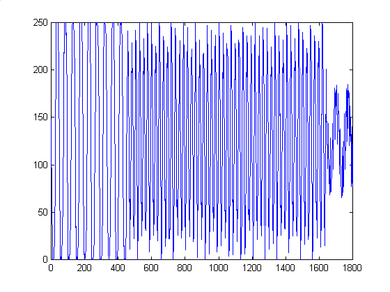 |
| Shutterfly | 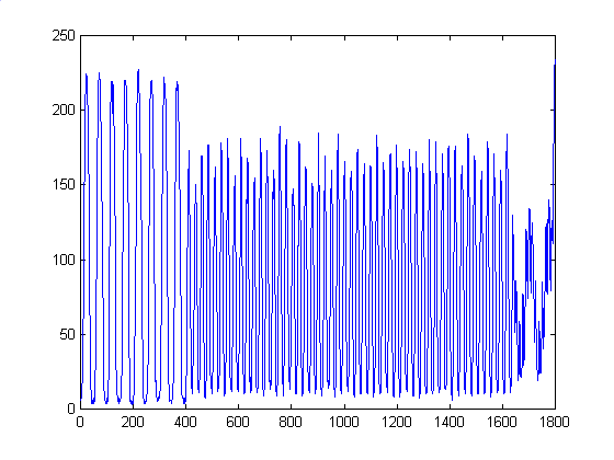 |
| OFoto | 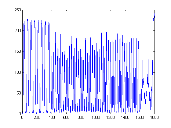 |
| PhotoNet | 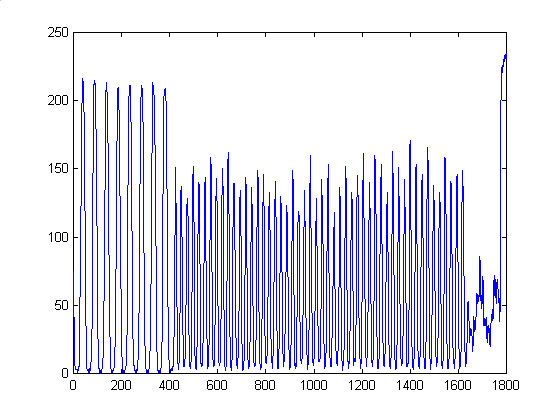 |
| PhotoAccess | 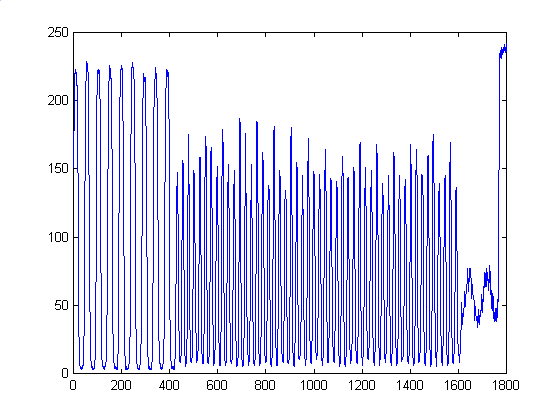 |
Average of Horizontal and Vertical Rect Functions
As stated before, we couldn't think of any clean metric we could use to measure the quality of the images compared to the test image. After passing though development and subsequent scanning, the images were way to dark to really see the mesh pattern very well. As a result, we will analyze each photo qualitatively instead.
Shutterfly - The picture tended towards the better side out of the 4 photos tested, and was especially good in reconstructing the lower frequency square at the top left corner. However, the photo suffers from aliasing after the top left square, though the aliasing is not as pronounced as on the Kodak PhotoNet. The image intensity overall was very good, and had a tone comparable to the original.
OFoto - Probably the worst of the set, the photo lacked equadistance spacing between lines, giving the image of a constant spatial frequency throughout the entire image. This photo couldn't even reproduce the lowest frequency averages correctly, making a pretty unappealing picture overall. The fact that it seems that every 5th line drawn is a little darker than the others makes the squares look larger than they should.
Kodak PhotoNet - Overall, the photo does really well at low spatial frequencies, and has significantly reduced aliasing in the center square when compared to the Shutterfly photo. However, at higher frequencies, the photo breaks down, with very strong aliasing on the right and bottom sides of the image This one also had more consistent shading across the entire image compared to the Shutterfly and PhotoAccess pictures, maybe because they have a better color reproduction schema than other companies.
PhotoAccess - Visually the cleanest photo of the 4, The photo did not have as well defined blocks at the lower spatial frequency end, but due to blurring or antialiasing techniques, the overall photo doesn't seem to exhibit much aliasing if any. Blurring does cause inaccuracies in this image, however, as the bottom right block becomes a solid gray instead of a fine mesh. Also, the shading of the photo varied a little more than the Kodak image, which created more pronounced boundaries between squares.
Pure Black and White Combined Image
In general, results were exactly the same as in the Average case. The main differences were that the images were noticeably darker thank the test image, and the photos were rendered in grayscale, rather than pure black and white. I assume they use a form of halftoning for most of these images, and as a result, the whitespace between each block is much less apparent than in the averaged horizontal and vertical rect functions case.
Large Checkerboard with 60x60 pixel squares
Due the the lower spatial frequency of this test image, the developers were able to more accurately reproduce this image. In general, all of the resulting photos were nice and sharp, with well defined boundaries. The graphs below show that despite intensity differences, the general trends remain consistent throughout all 4 photo samples. The rounding of the square wave is probably due to the blurring caused by the scanner, as the original photos had sharp, well defined edges. It appears that much higher spatial frequency patterns would be necessary to cause aliasing in an image.
| Vendor/Type | Cross-sectional plot |
| Original | 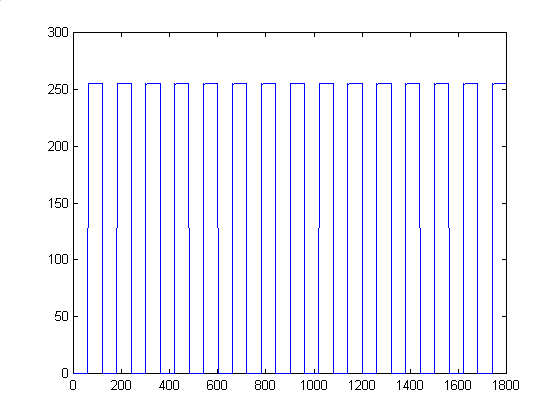 |
| Shutterfly | 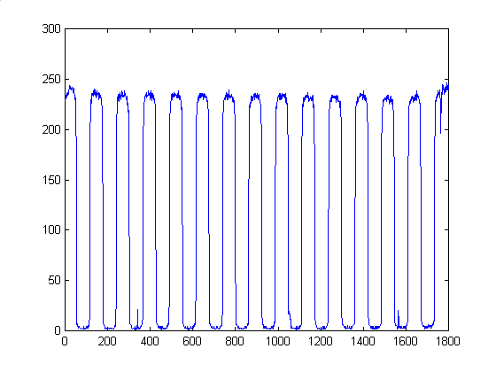 |
| OFoto | 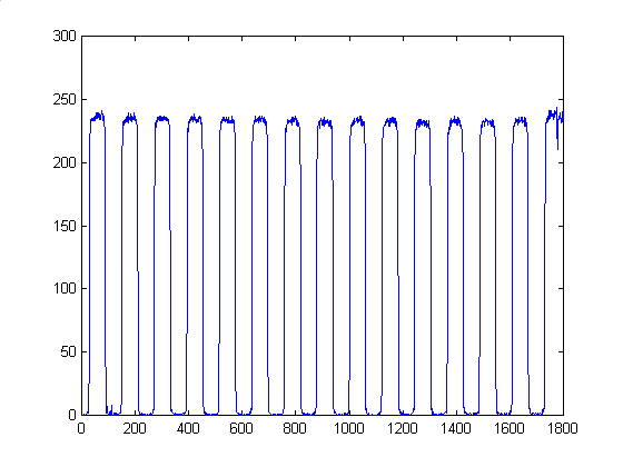 |
| PhotoNet | 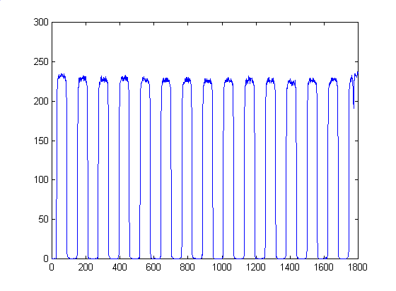 |
| PhotoAccess | 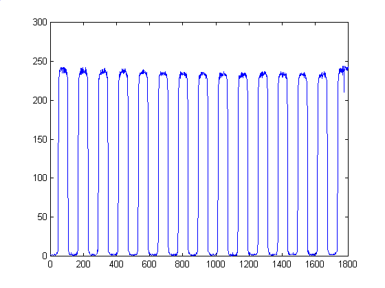 |
For the most part, the 4 images scanned in are basically the same. The have less sharply defined edges, but that's due to blurring by the scanner, rather than inherent problems with the photos themselves..
Observation | Evaluation Techniques | Analysis | Conclusion
From a purely aesthetic standpoint, due to antialiasing or blurring, it seems that the PhotoAccess photoes were generally nicer to look at than the other three vendor's photos. However, when cross sections are taken of each photo, the PhotoAccess photos are consistently the least similar to the test image, while the Shutterfly, OFoto, and Kodak PhotoNet photos are much closer. From this we conclude that just taking the 1200x1800 pixel images and doing a direct sampling onto a 4x6" photo isn't necessarily the best way, though it might preserve the waveforms of the original image the best. Additional processing helps the image greatly, especially for higher spatial frequency images. Each vendor seems to do pretty well with the lower frequency parts of the photos, and in all honestly, 90% of all the submissions they receive probably don't contain such high frequency patterns like these, and even then, they're most likely color photos, rather than drastic black to white transitions.