How Do the Colors Changes? Using Different Color Background to Investigate Color Balancing.
Chia-Hao (Jack) Yu
Alexan@leland.stanford.edu
![]()
Observation
We were quite excited when we found that the gray patches did not show up the same across different companies' processed photos. Some of the gray squares were hard limited to black and white, and some of the gray squares were masked with a little bit of the background color. The background color of some pictures was highlighted, i.e. the sin function pattern was exaggerated. However, we would hardly observe patterns from some of the pure Red, Blue, and Green photos. The following table is the receiving pictures.
[Click on Images to View Larger Size (1200 by 1800)]
|
Test Color |
Shutterfly |
Ofoto |
PhotoNet |
PhotoAccess |
|
Red |
|
|
|
|
|
Green |
|
|
|
|
|
Blue |
|
|
|
|
|
Yellow |
|
|
|
|
|
Orange |
|
|
|
|
|
Purple |
|
|
|
|
|
Observation |
The gray color patches of R,G,B seemed to not changing very much. However, there was a large different between the yellow and purple gray patches. |
The sin patterns of R,G,B were gone, and the lighter gray patches of R,G,B, were very close to white. The pictures seemed to be overall darker. |
The sin patterns of R,G,B were barely seen. The G and B were especially bright The gray patches of purple is especially purplish. |
Wow, the purple was really dark. The gray color patches varied quite drastically across different color images. The sin patterns were only easily seen in Yellow, and Orange. |
[Table 1: Result of Color Balancing Photographs]
Introduction to Analysis and Evaluation
At first glance, there was a lot of information from the table of pictures above. We could tell a lot of stories by just observing interesting difference and patterns on these pictures. However, to understand these pictures in a more systematic level, we decided to analysis these pictures in the space of Luminance and Chromaticity. There were of course system errors that we added when we used the scanner to scan the pictures into digital form. However, to simplify the further analysis, we decided not to calibrate the stored digital images. We assumed that the distortion of the scanner was linear in color space and luminance, and thus our analysis was most a linear transformation away from the true ones.
Luminance Analysis
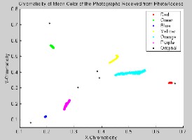
There were two parts to this analysis. First, we did the luminance calculation on the 4 gray patches from each photo. Only 100 by 100 pixels of each 4 patches were drawn from the digitized images, and they were more or less at the center of the gray patches. Moreover, we took the mean RGB value of the 100 by 100 images, and then converted that into a LAB space. The following table is a description of this analysis.
|
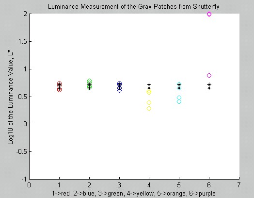
Shutterfly |
|
|
Note |
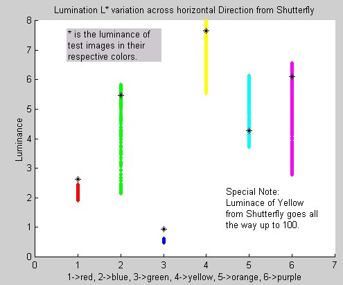
The black * are the luminance value of the gray patches on the test images. We can see that the R,G,B's gray patches' luminance were quite close to the original gray patches. The purple one was off by an over of 100. The lighter side of the patches was transformed to almost white. |
|
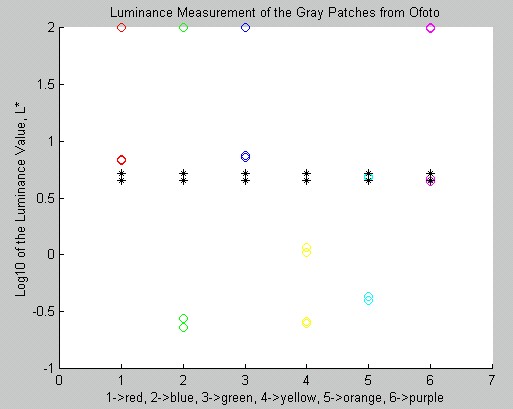
Ofoto |
|
|
Note |
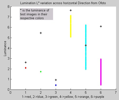
Wow, there were a lot of shifting in this picture. Ofoto seemed to hard set the lighter gray of R,G,B,P to white. The darker gray patches of green were almost black, and so were the yellow's. Ofoto might do some sorts of luminance step decision function. |
|
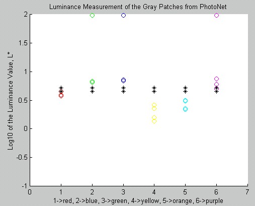
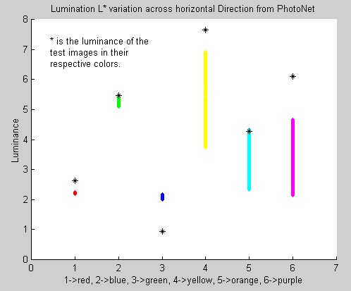
PhotoNet |
|
|
Note |
Interesting enough, the lighter gray patches of G, B, and P were shown up as almost white, but the darker gray patches were not too dark. |
|
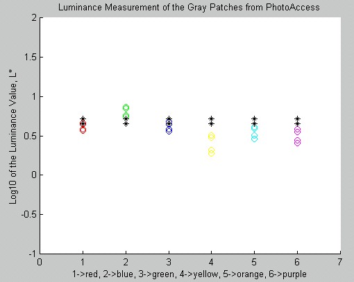
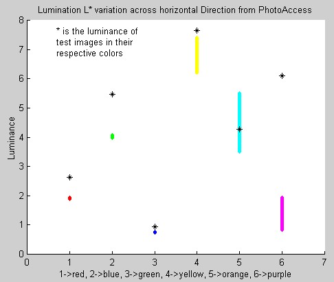
PhotoAcecss |
|
|
Note |
PhotoAccess did probably the best job in matching the gray patches to their original luminance. Most colors' gray patches became darker by the G one. This was probably due to the scanning system error. |
[Table 2: Luminance Analysis on Gray Patches of Different Color Background. Click here for Matlab Code.]
The second part of the luminance analysis was on the color pattern itself. We simply took a section of 201 by 801 pixel from the center of the scanned images, and we made sure that there were no obvious artifacts. Then, since the pattern changes horizontally, we took the mean across the vertical direction. Thus, we had a 1 by 801 pixel representing the mean of the color images in RGB space. Then we plotted the corresponding L of each image in both ways. The first way was plotting the variation vertically, so we would be able to see the span of the luminance levels. The second way was plotting the variation horizontally, so we would be able to see the pattern of the luminance changes. The following table is the result.
|
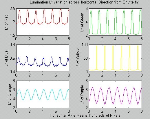
Shutterfly The luminance of Yellow goes all the way up to 100. Shutterfly seemed to boost up the yellow. |
|
|
|
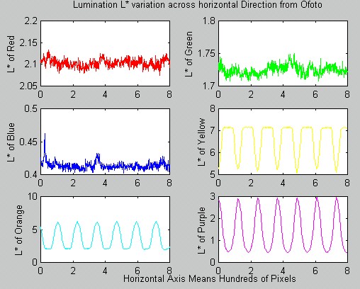
Ofoto Like we could observe from [Table1]. Ofoto's color was considerably darker then the original test images. |
|
|
|
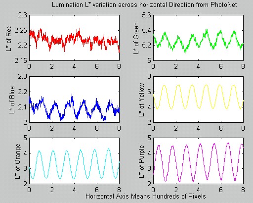
PhotoNet The Blue was a lot brighter comparing with other companies' blue. |
|
|
|
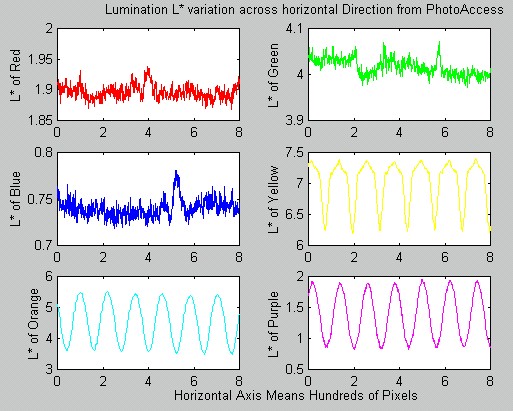
PhotoAccess PhotoAccess had the tightest bound for the luminance across most of the color. |
|
|
[Table 3: Luminance Analysis on Different Color Background. Click here for Matlab Code.]
In general, the luminance patterns were not apparent in R, B, and G in PhotoAccess's and Ofoto's pictures. That also confirmed our observation of not seeing color patterns on the pictures that we received back. Shutterfly seemed to like Yellow so much that they boosted up the brightness. We all knew that Yellow was the dominate color for luminance for human visual system. That was why for most of the plots on the second column, Yellow was considerably higher than other colors. For all of the Yellow, Orange, and Purple color patterns, the luminance was very clearly a sin wave, which matched the original pattern design. It was interesting to discover that Shutterfly used interesting filter algorithm such that the R, G, B, and Y's luminance had such interesting shape.
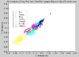
Chromaticity Analysis
Other then illumination, chromaticity is also an interesting character to investigate. The gray patches would change color slightly due to the color balancing processing, and the following plot is a visual representation of the clusters of the color changes of these gray patches, and the color changes of the background colors.
|
Gray Patches |
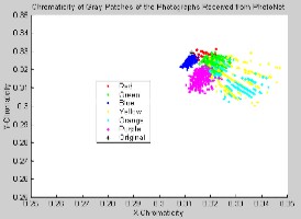
Sin Modulating Color Background |
|
|
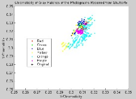
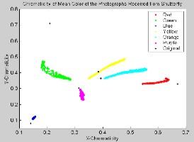
Shutterfly |
|
|
|
Note |
The chromaticity of the gray patches from yellow and orange background were especially spread. The rest were quite compact as it should be |
Well, the sin function modulation seemed to affect G, Y, and O the most. The color with high component of B doesn't seem to be affected too much, |
|
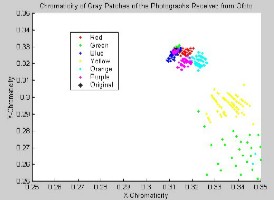
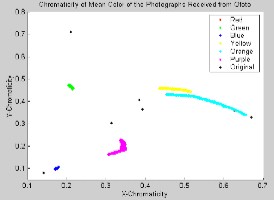
Ofoto |
|
|
|
Note |
Wow, the G and Y were especially spread for the gray patches. It seemed that the spread of Y was because of the spread of G, and G was spreading to the opposite direction of the true G. |
The R,G,B background were especially compact. However, the orange and the yellow were spreading a little bit. |
|
PhotoNet |
|
|
|
Note |
The chromaticity of the gray patches were quite compact. Only a slight spread from the Y,G, and Orange. |
PhotoNet seemed to control the spreading of the color rather well. None of the color were spreading too much, and the relative locations were also quite close to the true color |
|
PhotoAccess |
|
|
|
Note |
The gray patches from PhotoAccess seemed to spread to the direction of the color B. There might be some interesting processing of the color B from PhotoAccess. |
Similar to PhotoNet, PhotoAccess was able to control the spreading of the colors quite well. |
[Table 4: Chromaticity Analysis on Different Color Backgrounds and their Four Gray Patches. Click here for Matlab Code.]
One had to be really careful in looking at these pictures. Even though the ones on the left were spreading quite widely, one could not forget the scales of the plots. The Y-Chromaticity was only ranging from 0.25-0.35, and the X-Chromaticity was ranging from 0.25 to 0.35 as well. This area covered only quite a small region of the plots on the right.
With these plots, we could intuitively to understand some characteristics of the photo printing processes. The spreading of the gray patches indicated that there were some color masking and color balancing filtering being applied to the digital bits that we supplied to the companies. The convergence of the colors to the center of the chromaticity chart showed that the R,G,and B were usually adjusted to a more neutral color, and the Purple, Orange, and Yellow were diverged away from the center presented us that the color difference was usually highlighted.x